
Things To-Do Redesign
- Product
- Web
- 2022 – 2023
Improving conversion and reducing development time by redesigning Things To-Do
On tiket.com's Things To-Do, users can buy activities like attractions, events, playgrounds and much more. But the design had become outdated and hadn't been refreshed in a long time. Our task was to redesign the entire To-Do flow, including responsive layouts to support our developers' move to React, so we could cut development time and work more efficiently.
We also tackled several existing user experience problems. It was a major overhaul, giving the outdated pages a fresh new look with our new design system.
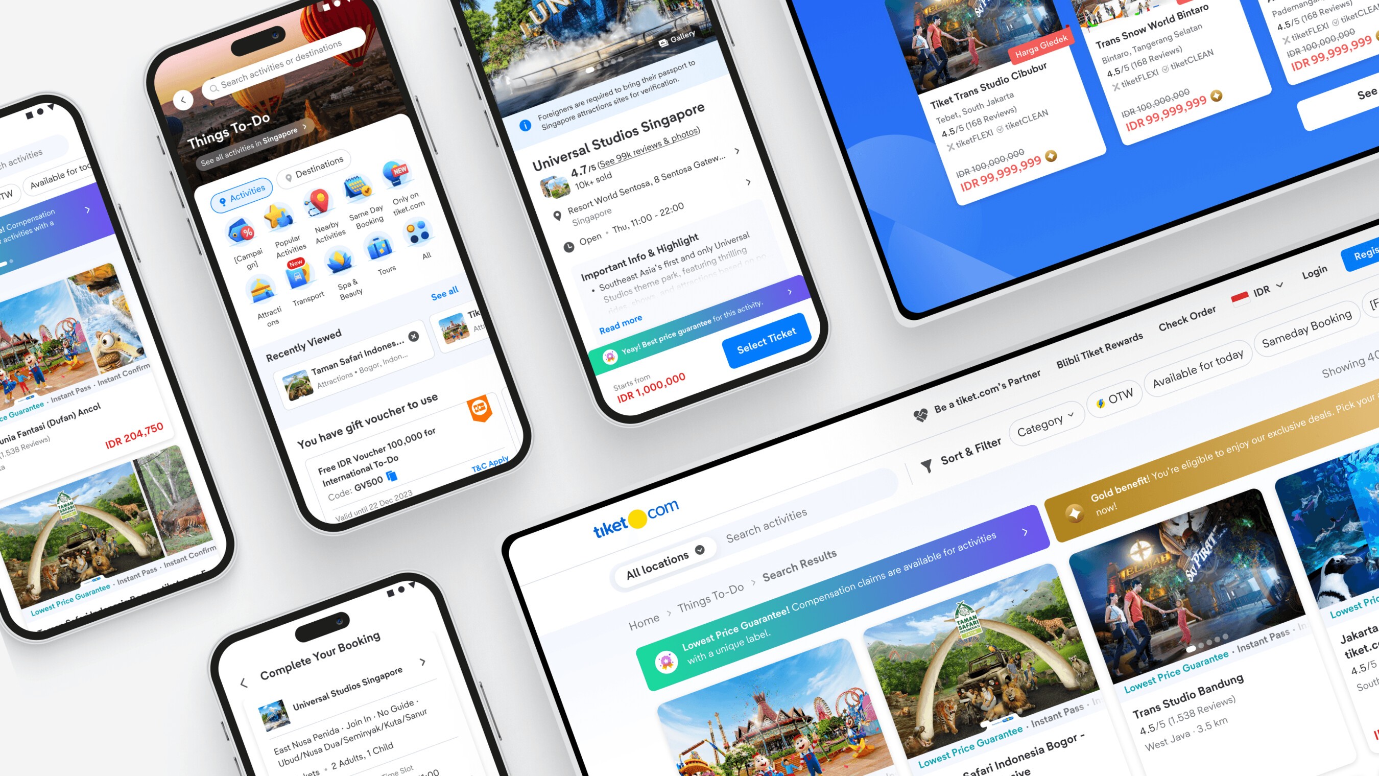
End to end flow
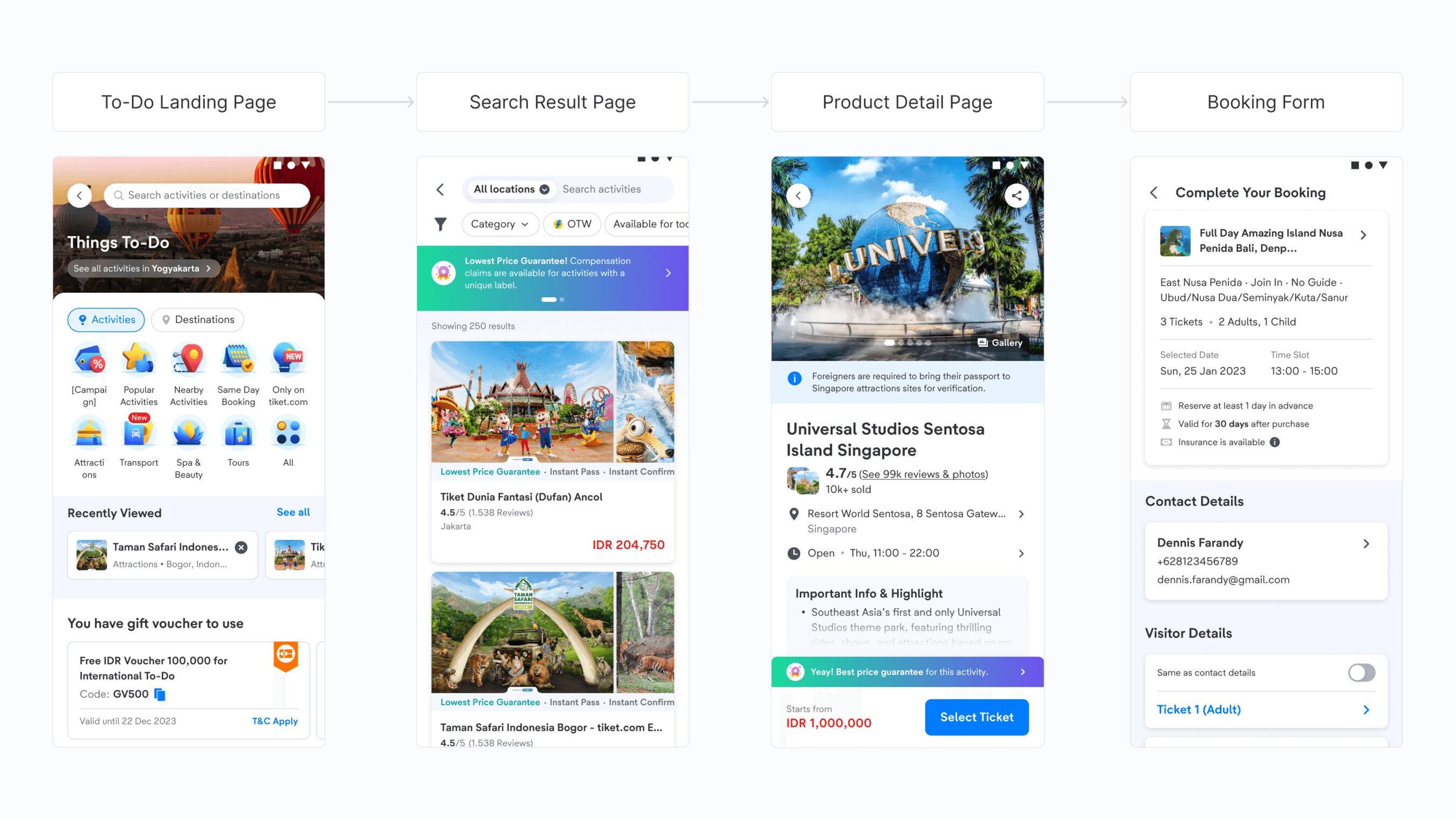
Our streamlined end to end flow has four pages from discovery to purchase. There used to be five, with a Price Tier page before the booking form where users had to set up their order. Our user research showed this page felt redundant, so we simplified it and moved it into the product detail page, making purchases quicker. Let's dive into each page below.
Landing Page
The first step of discovery, where users find inspiration for their vacation activities through personalized recommendations.
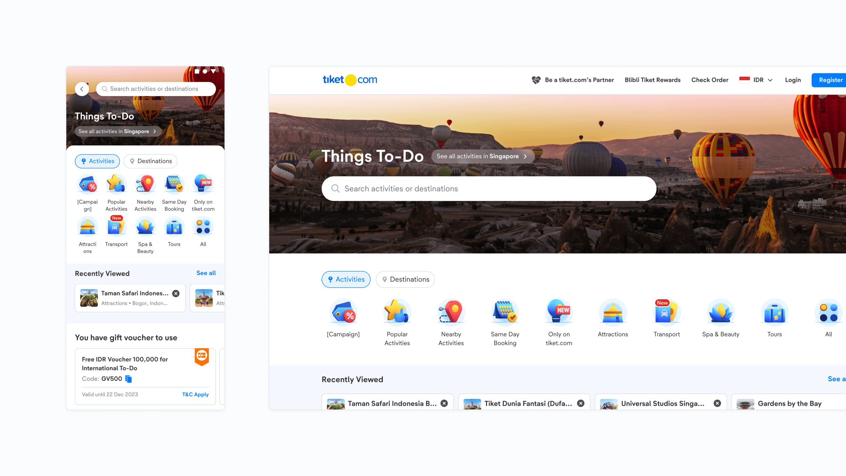
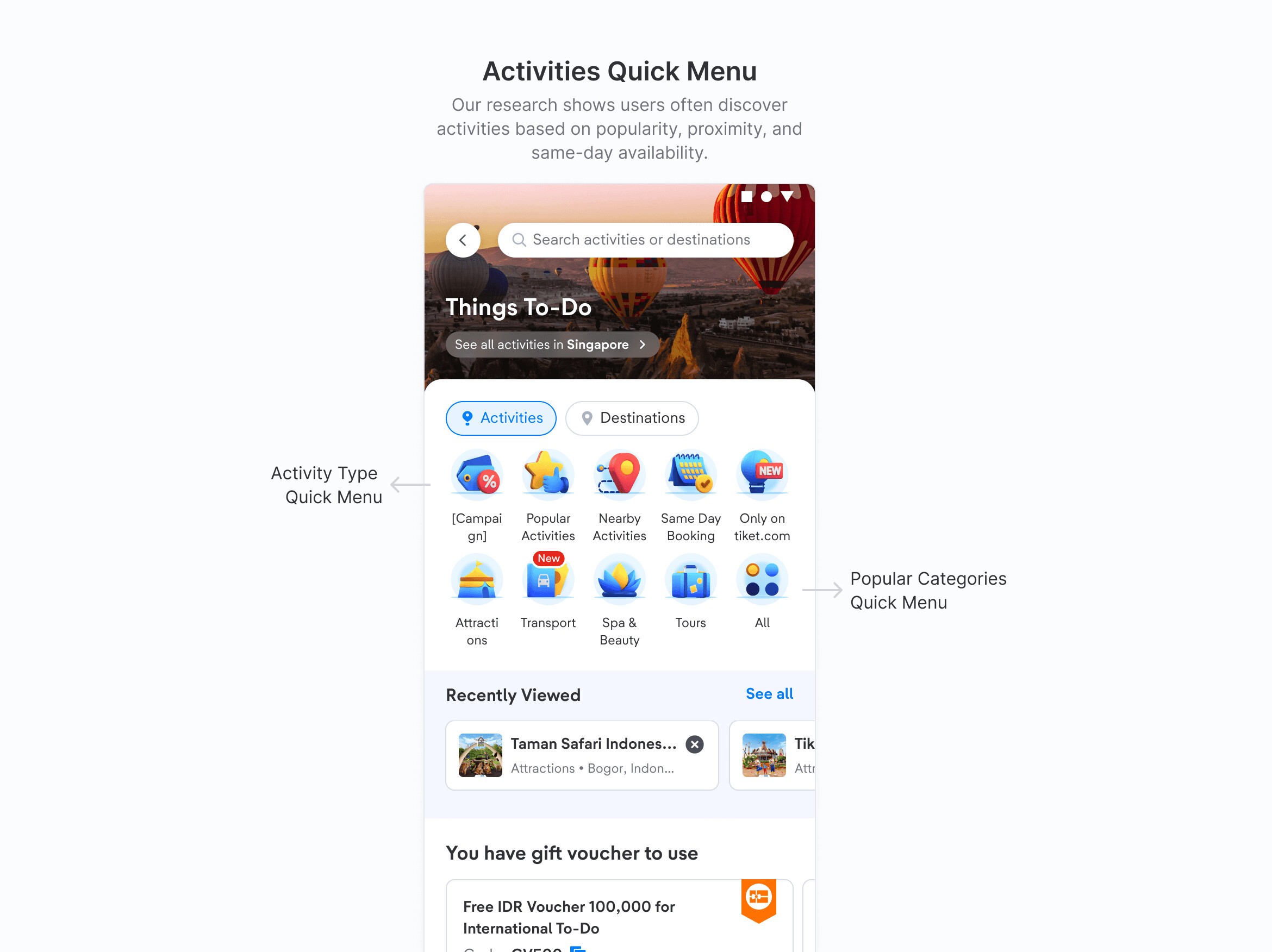
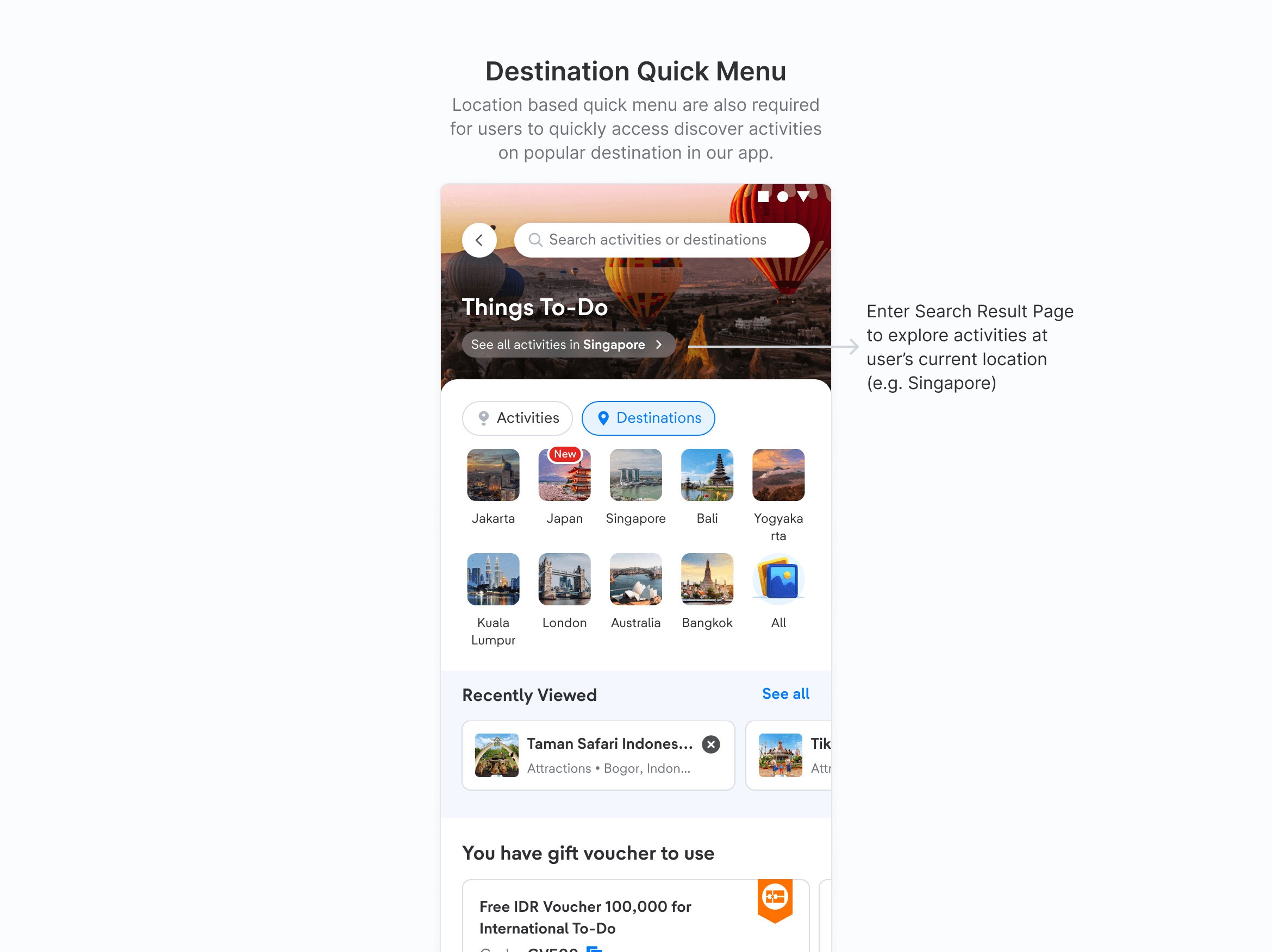
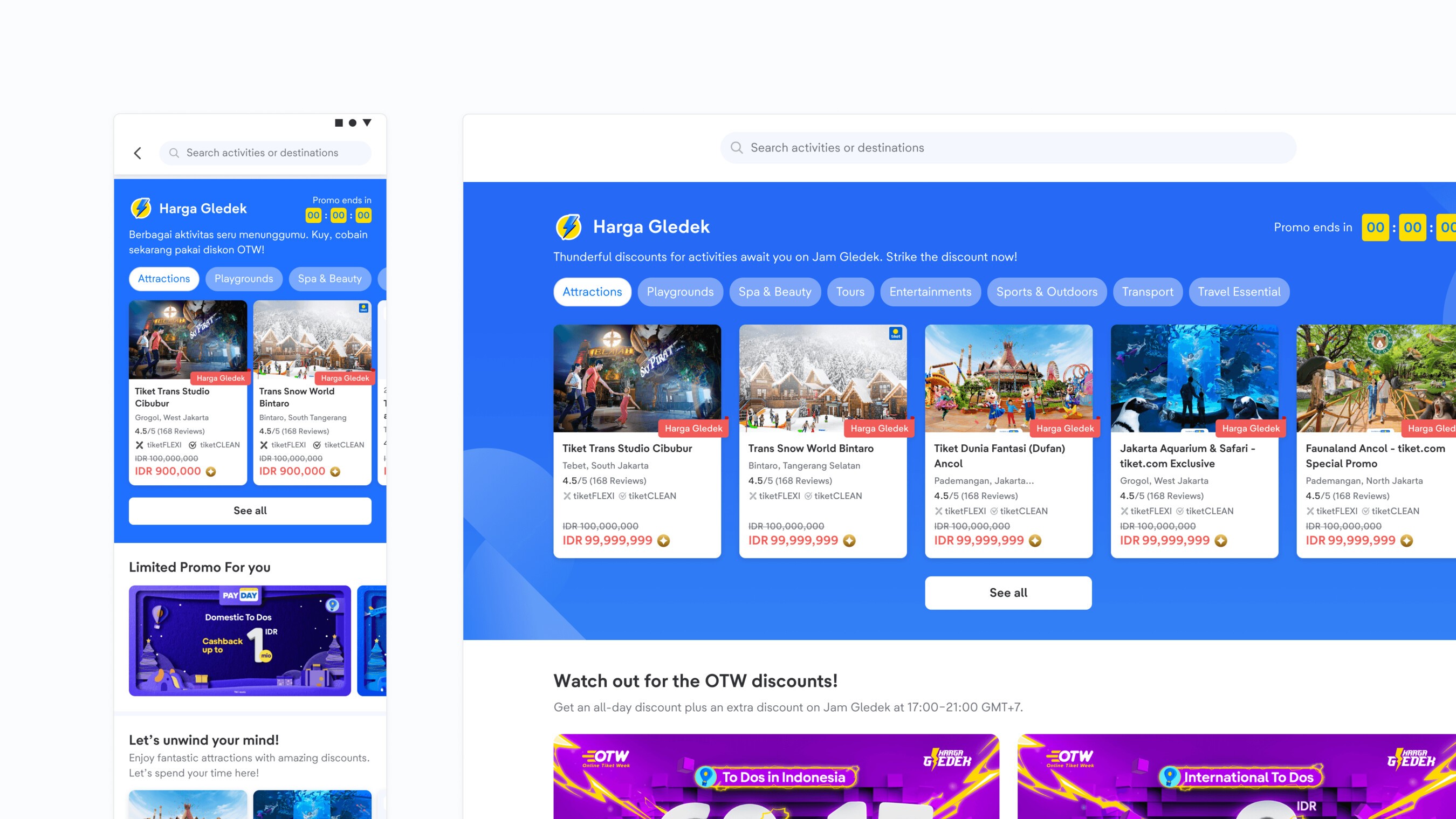
To keep inspiring users, we show dynamic product recommendations based on their search behavior. Knowing that users are mainly driven by low prices and discounts, we also show ongoing promos and campaigns to motivate them to buy.
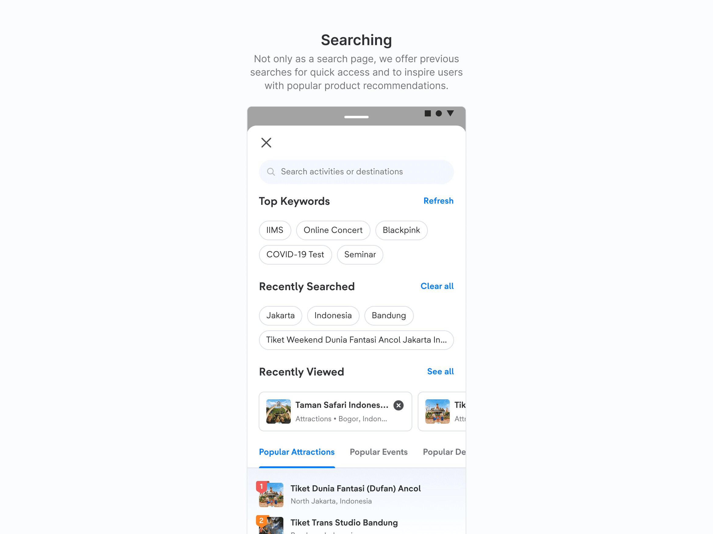
Search result page
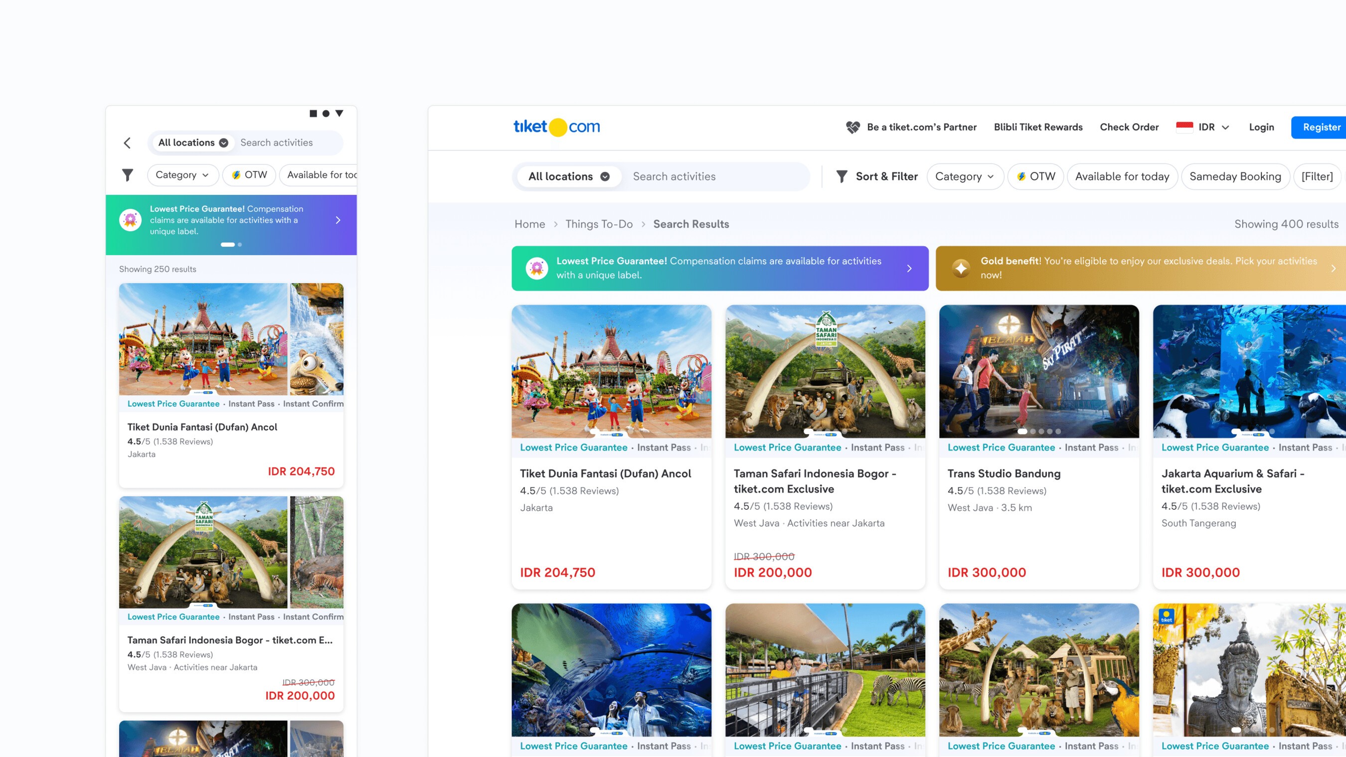
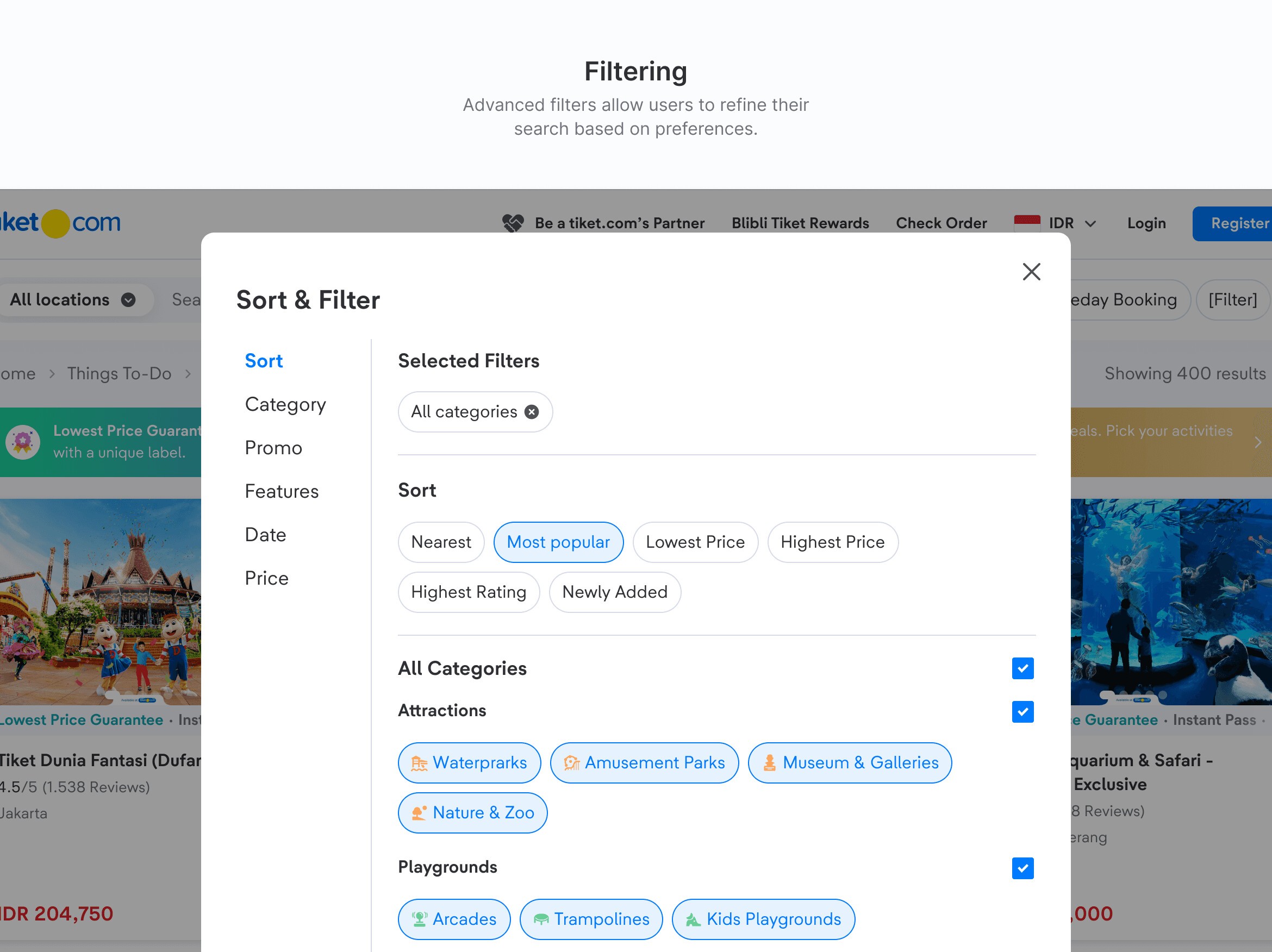
Users reach the search result page by searching keywords, viewing all recommendations or using the quick menu on the landing page. It holds a broader list of results, letting users explore and discover products tailored to their preferences and needs.
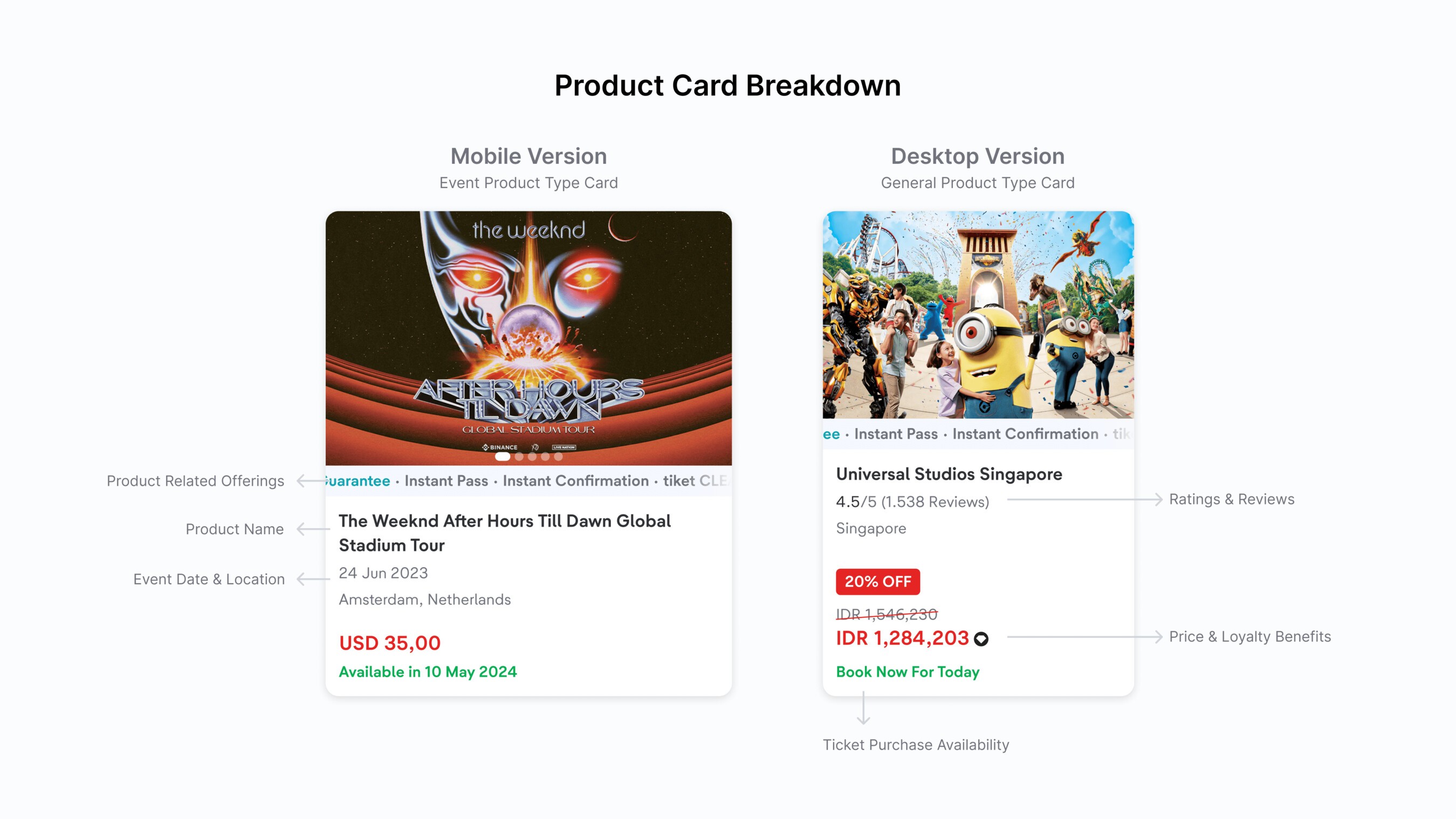
Product detail page
After picking a product, users land on this page to learn more about it and its packages.
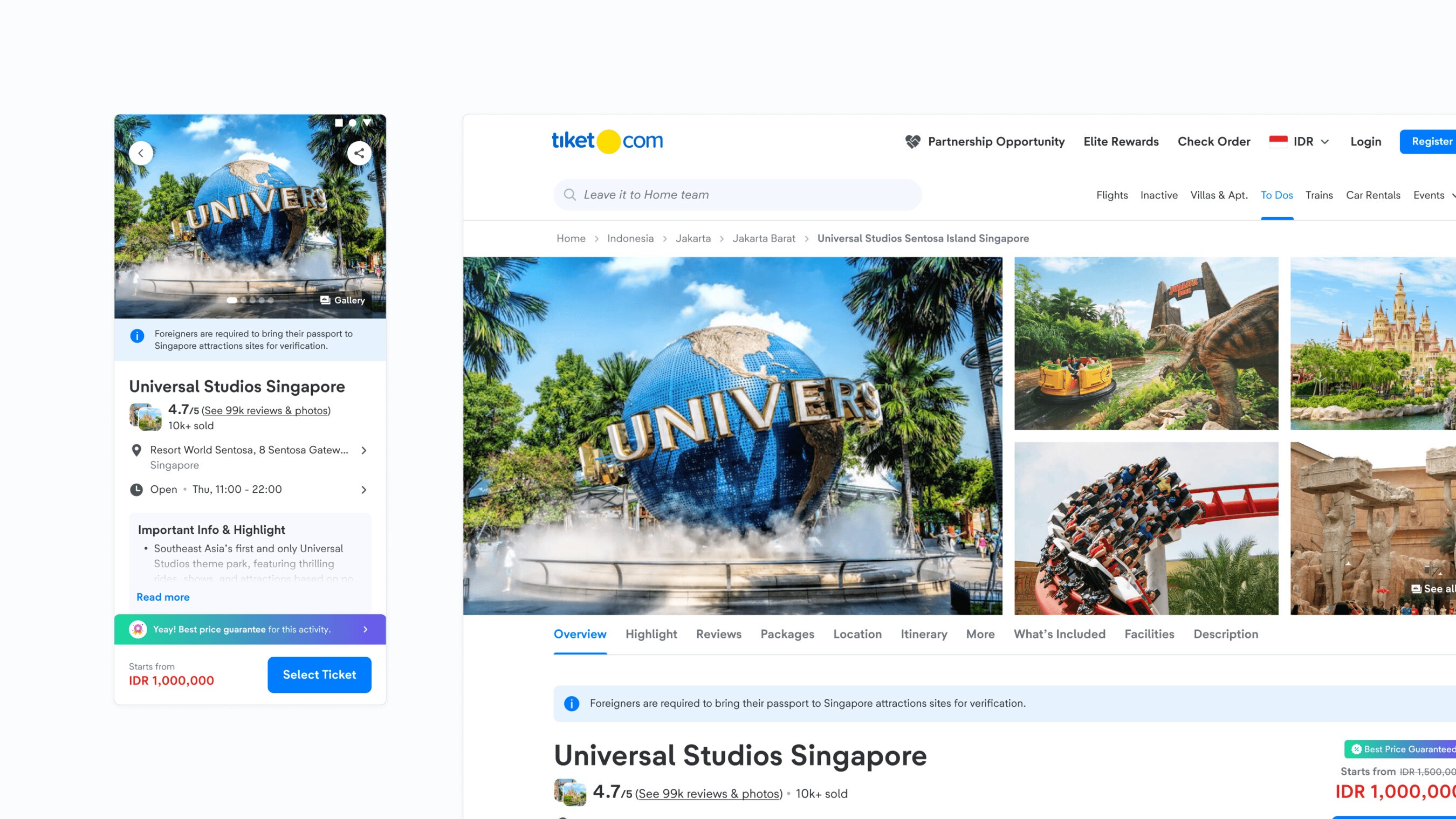
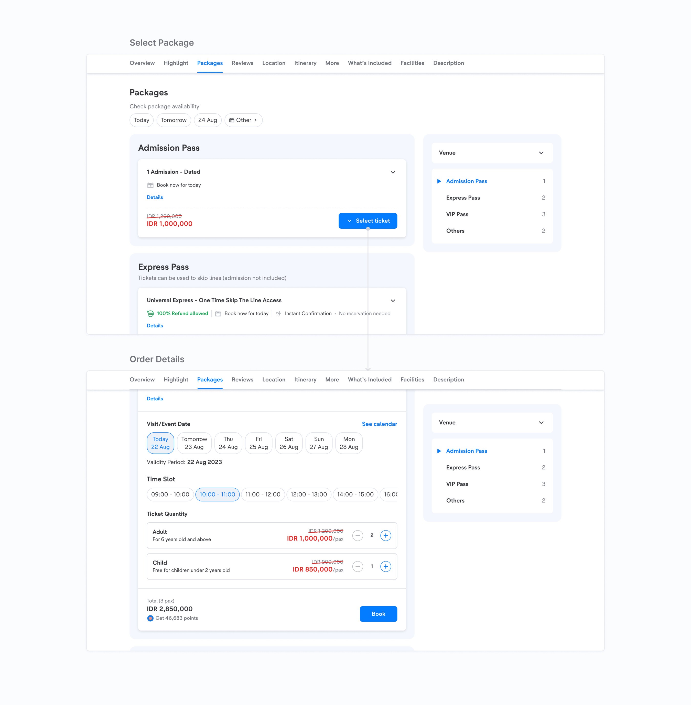
In the package section, users can explore and compare package benefits to find the best fit. Once they've decided, they pick and set up their order in our simplified Order Details pop up, which used to be the standalone Price Tier page.
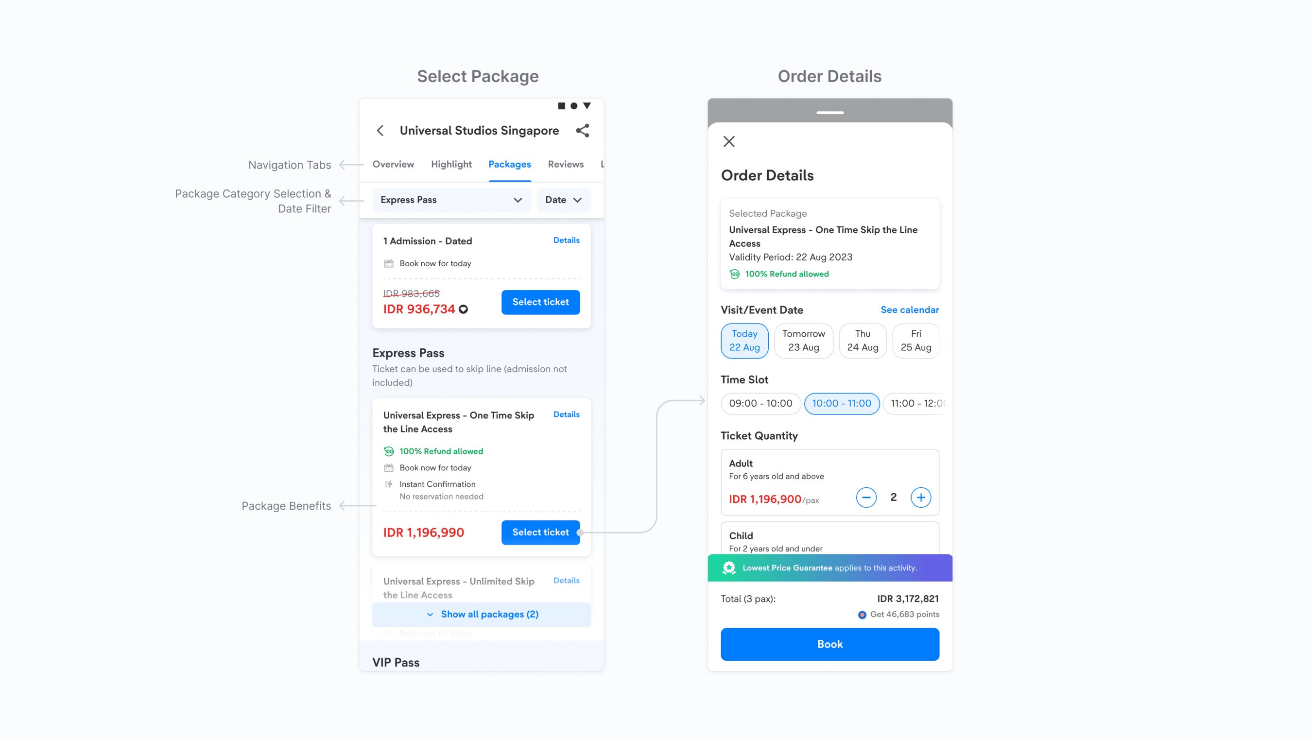
On desktop, instead of a pop up, we used the extra space to expand and collapse packages in place, so users stay on the product detail page while choosing.
Booking Form
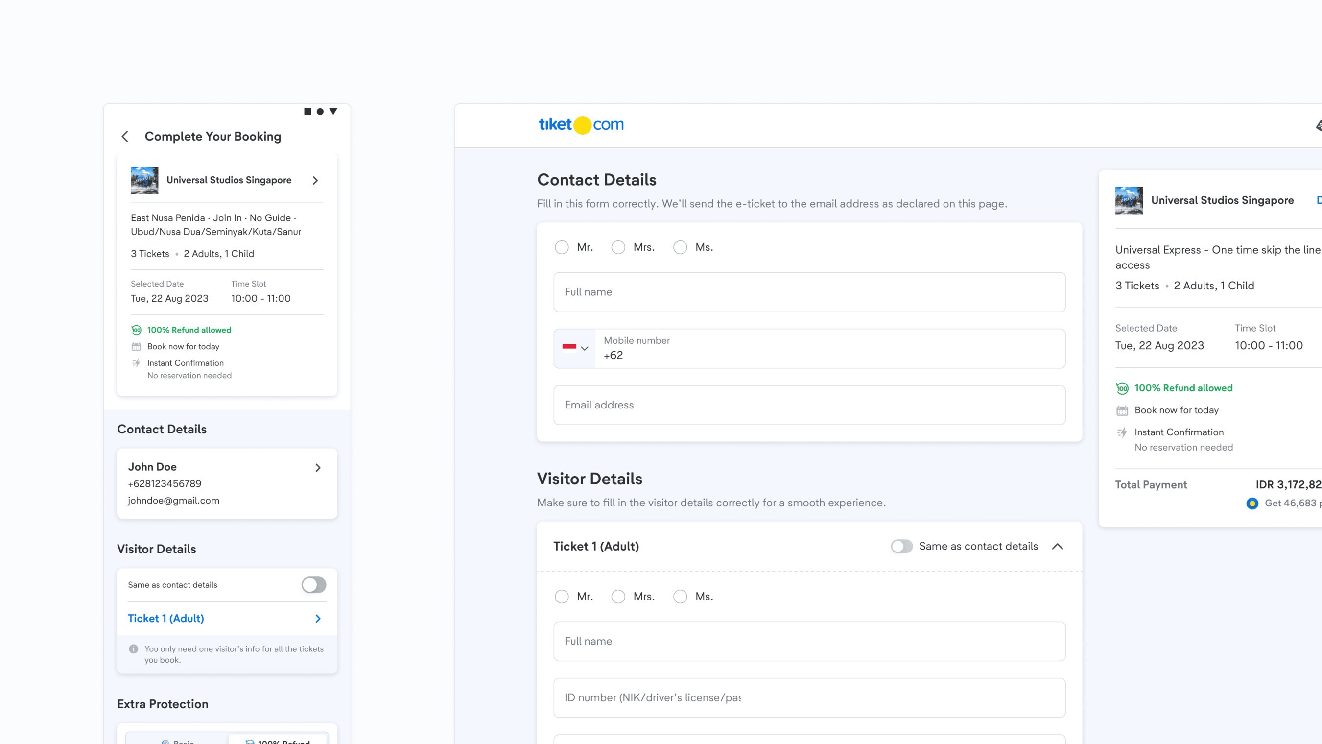
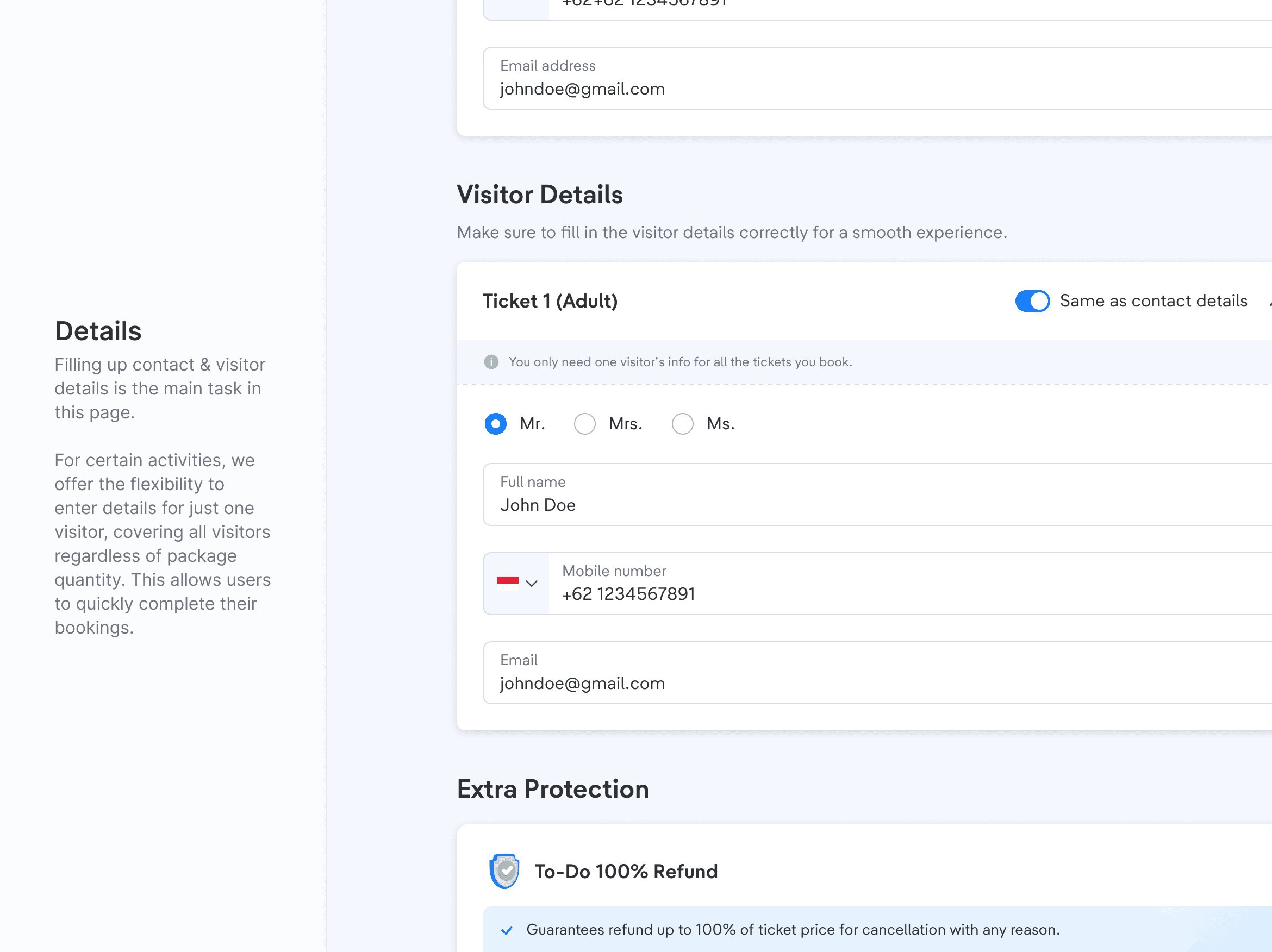
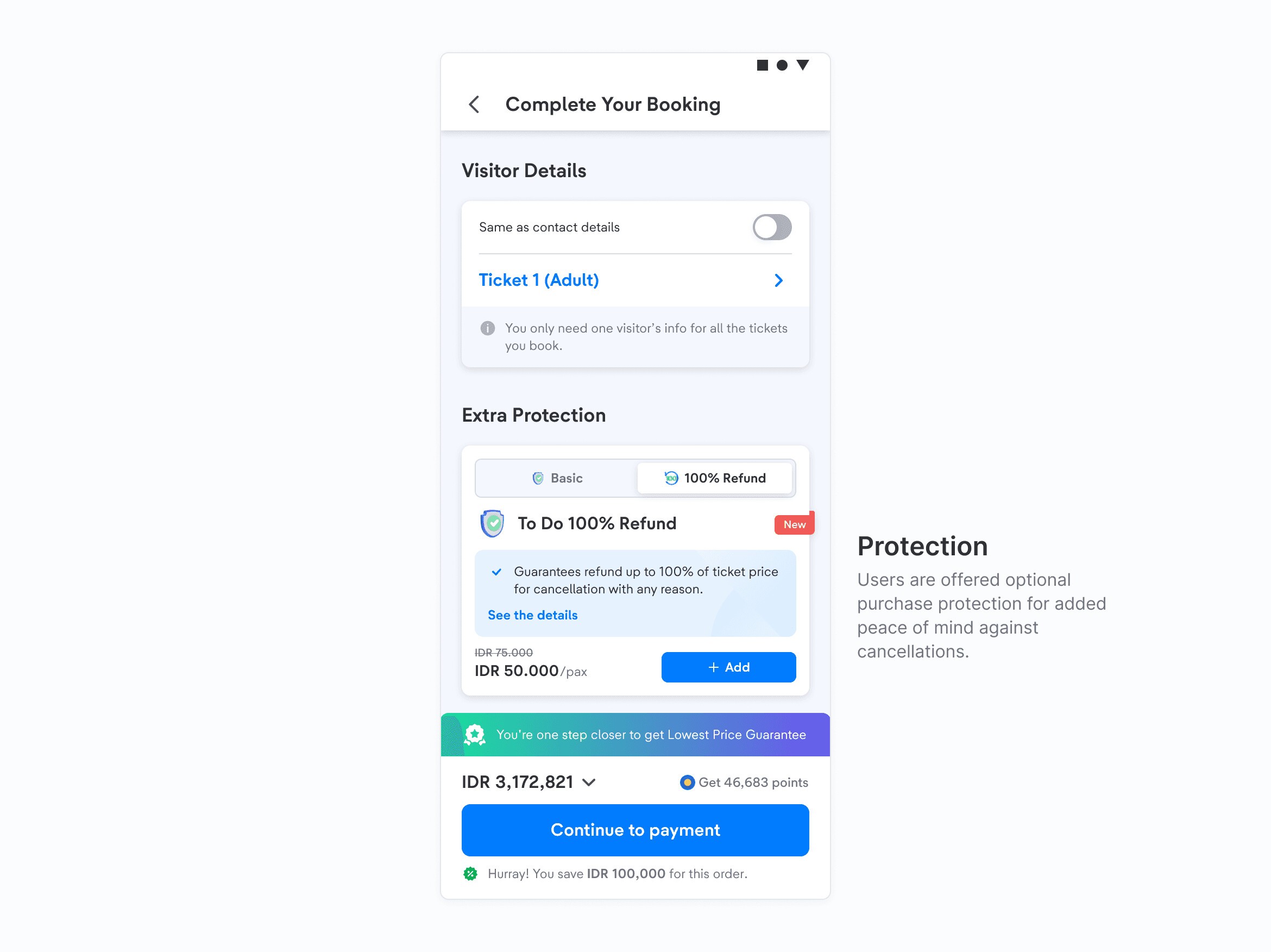
After setting up their order, users go to the booking form, the last page before payment. Here they review their order, fill in the personal details needed for the purchase and can add insurance for protection.
Post-Launch
The project took nearly a year from design to launch. We ran multiple A/B tests to validate and improve the redesign, and we still run experiments to keep improving it. The redesign had its challenges, but the result, a refreshed Things To-Do, made it all worthwhile.