
Best Suited Promo
- Product
- 2022
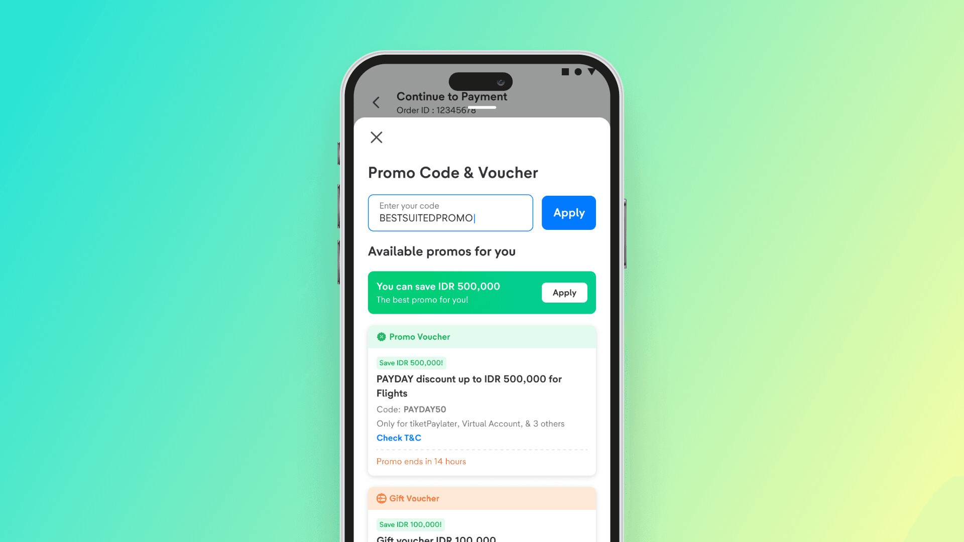
Increased payment conversion to 75.2% with Best Suited Promo
User Problems
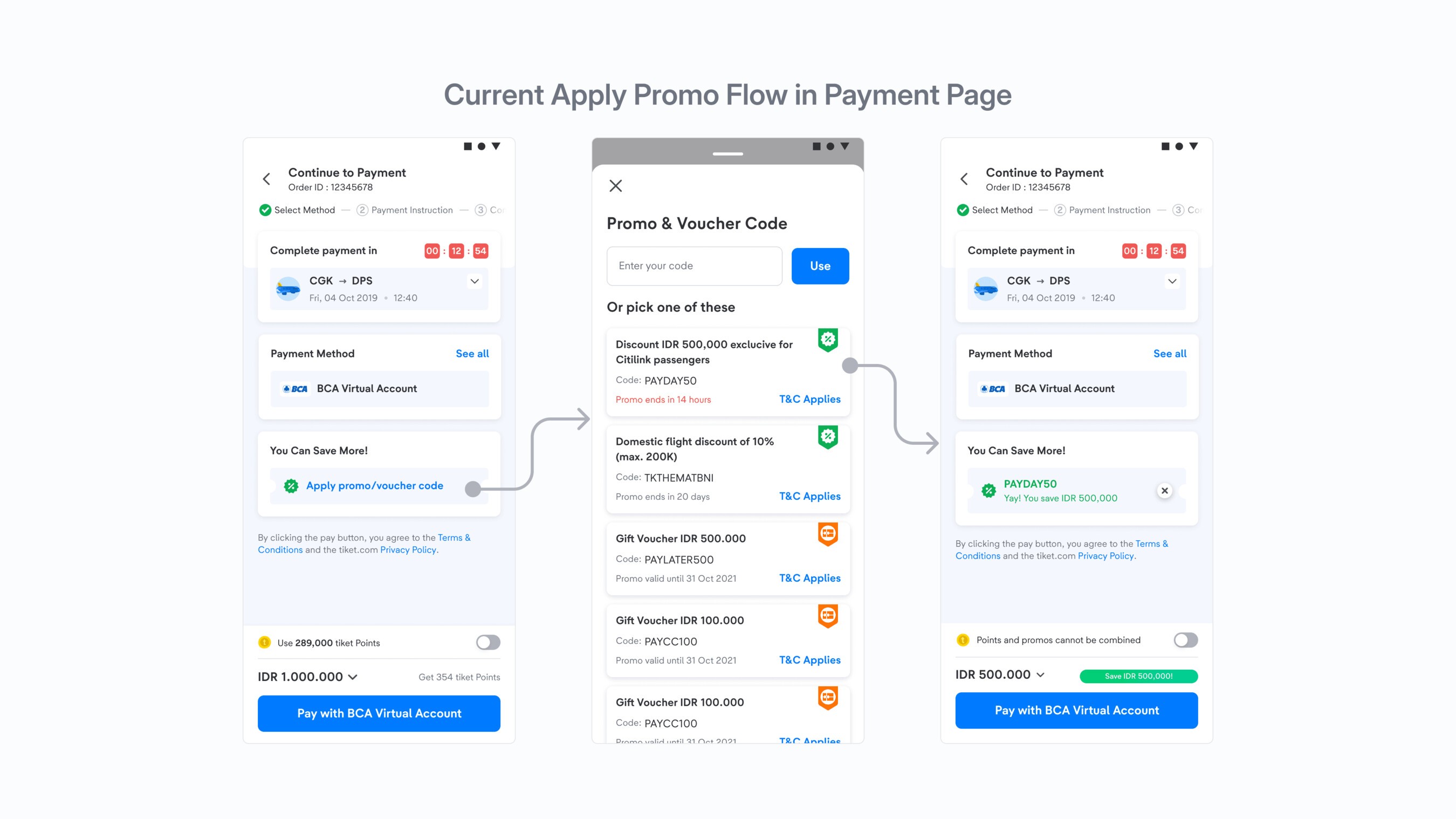
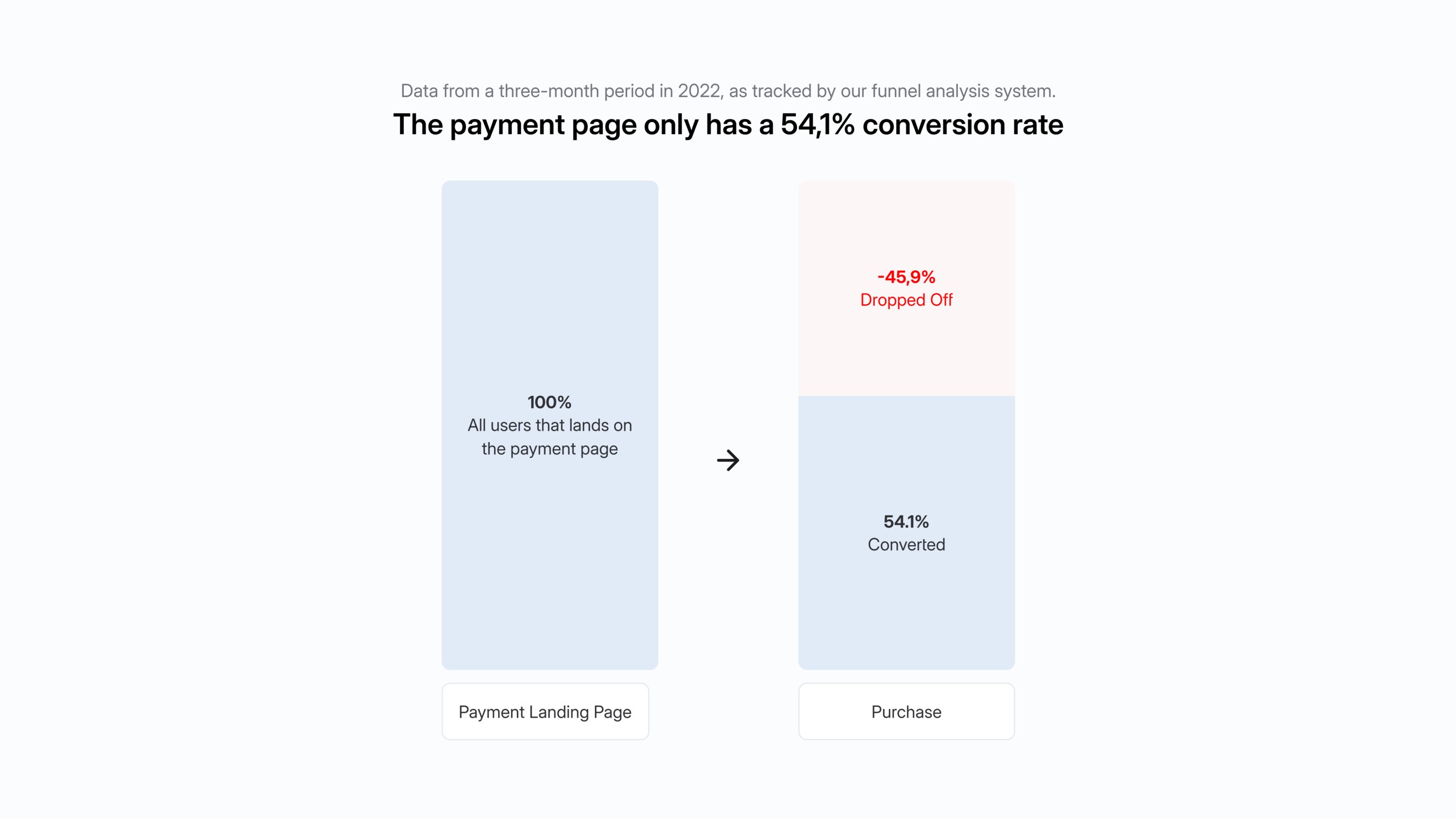
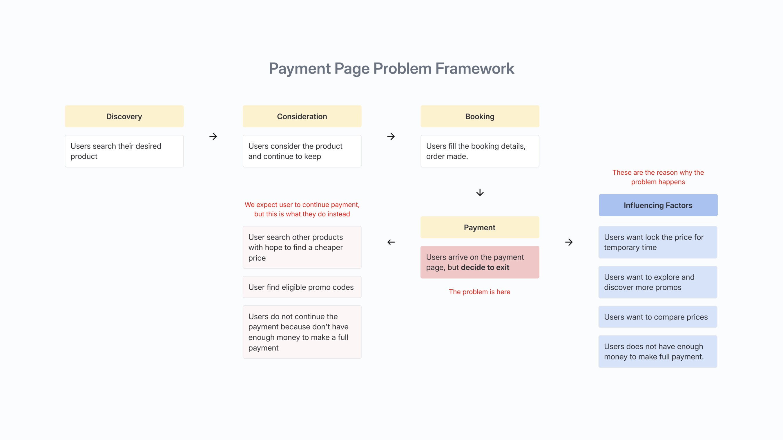
Our funnel tracker showed only a 54.1% conversion rate on the payment page. To raise it, we looked into where users dropped off to pinpoint the issues. Users left the payment page without paying for various reasons, mostly to hold the product first, compare prices and check promos. One interesting finding: even users who had already picked a payment method and applied a promo often didn't continue to payment.
Since this problem came from a funnel analysis, we validated the findings further with:
Qualitative research
User interviews to understand users' problems and needs, based on these behaviors on the payment page:
- Users who land on the payment page but take no action.
- Users who reach the payment page and pick a payment method, with or without a promo code, but don't continue to payment.
- Users who click the payment button but don't complete their transaction.
Quantitative research
The interviews showed that users mostly leave without paying because they want to hold the product first, compare prices and check promos. We validated this with a survey, getting statistics from a bigger audience to guide the design direction.
Overall research results
Our users are very price sensitive. In our survey, 89% of customers check all available promos before making a transaction, making promos the biggest factor in deciding whether to continue to payment.
Promo eligibility mainly depends on the minimum order value, approved vendors (e.g. airlines) or payment methods. The survey showed users are willing to switch payment methods and vendors to use eligible promos with bigger benefits, rating their interest in doing so 8.53 out of 10.
Across all user groups, users preferred finding promos on the homepage, often leaving the payment page to look for them. They see the homepage's main promo section as the top source for promos, and often felt the promo information on the payment page wasn't good enough.
In interviews, users were generally happy buying on tiket.com, with no major problems in our information architecture or design. But seeing all promos and making sure they get the best price at checkout remained the key problems. So we set out to improve navigation and refine the promo list, a critical part of the payment journey, to help users make informed decisions.
How might we let users apply the best promo for their order, so they get the best price possible without leaving the payment page?
UX Audit Problems
Let's look at our existing promo list. A promo's eligibility mainly depends on vendor type (e.g. airlines), payment method and minimum order amount.
Problem 1
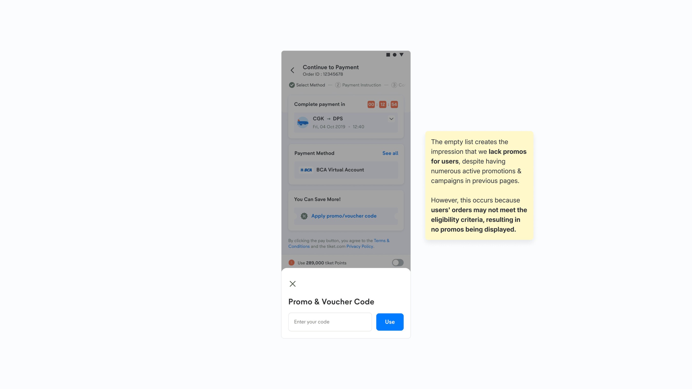
Empty promo list page
The promo list showed nothing when no eligible promos were available, leaving only the promo code field. This was a significant problem: despite extensive promo campaigns earlier in the funnel, users whose orders didn't meet the current promo criteria found an empty list. That's what led them to leave and check promo eligibility on the homepage instead.
Problem 2
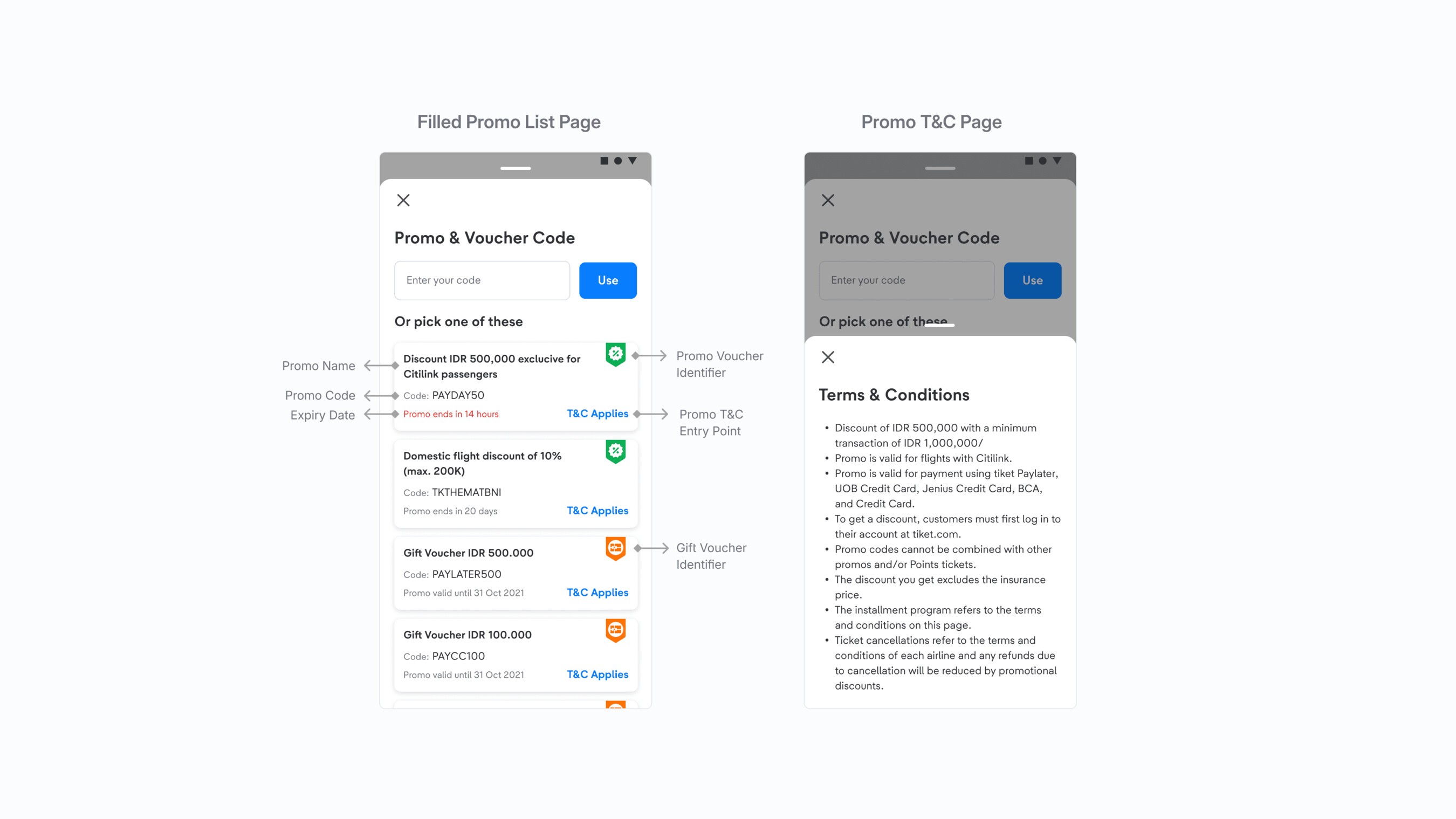
Promo eligibility requirements lack visibility
The main eligibility criterion for promos is the payment method, but this crucial information was buried in the terms and conditions, which took extra steps to reach. Users felt the information wasn't clear enough to convince them to apply the promo.
Problem 3
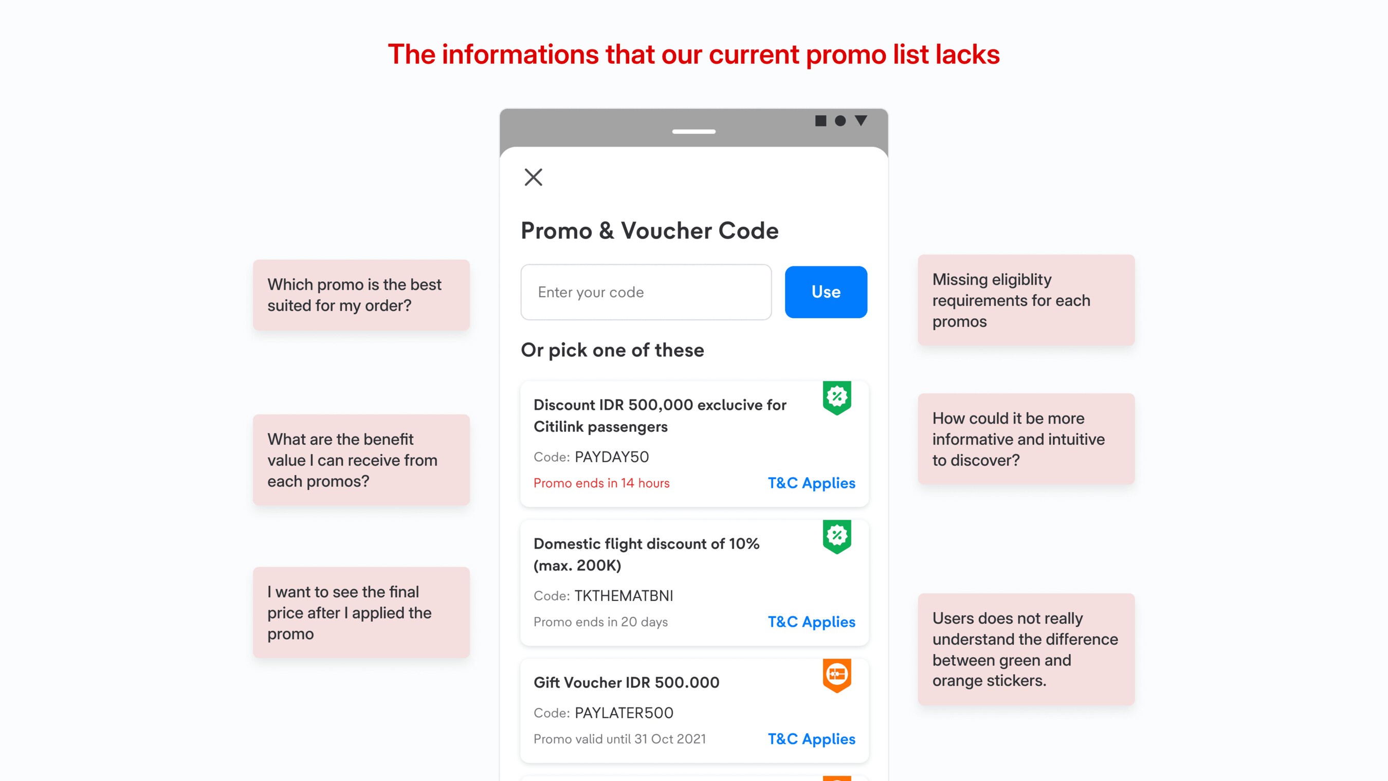
No assurance of a promo's value
There was also no information about how much eligible promos were worth, so users had to apply each promo one by one and go back to the payment page to see how much each one took off the price.
First Iteration
In response, we ran ideation sessions with stakeholders to find the best solutions. We planned A/B tests to reduce risk before fully rolling out the revamped promo list, measuring its usability and impact on targeted user groups. The main goal was to let users apply the most suitable promo for their order, getting the most out of it without losing essential information, and to raise payment conversion quickly and effectively.
Improvement 1
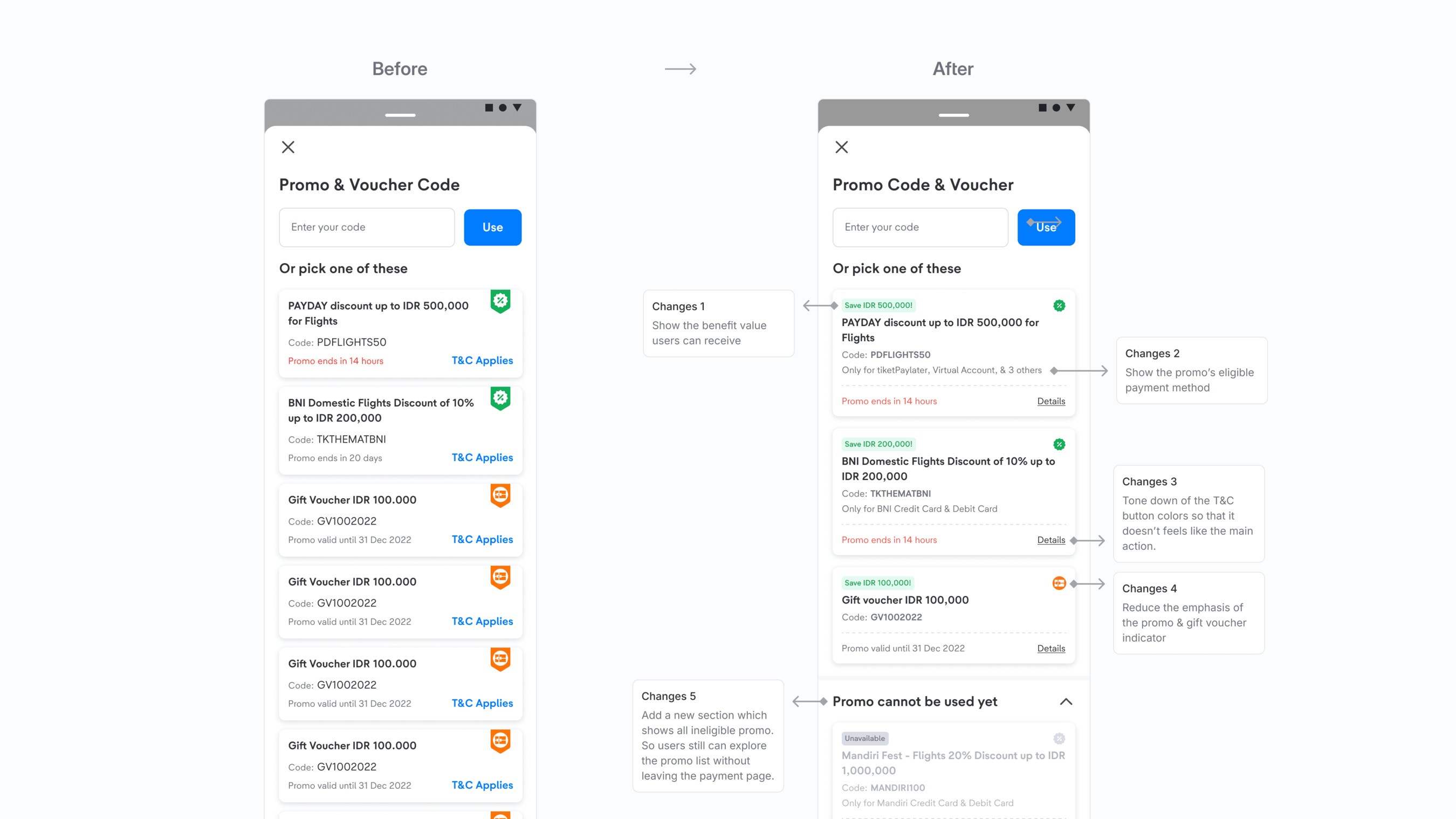
Page structure and promo card information
We split the promo list into two sections, eligible and ineligible promos, so users can discover promos right on the payment page instead of leaving. We also made the information on each promo card more useful:
- Benefit information: users can now easily see how much they'd save with each promo, helping them pick the best option.
- Eligibility requirements: the main criterion, the eligible payment method for each promo, is clearly shown, so users have what they need before continuing.
Improvement 2
Letting users apply the best suited promo
Our main goal was to remove the need to go through the whole promo list to find the best promo. We explored three variants, each letting users apply the best promo with a single click, making it simpler and more convenient.
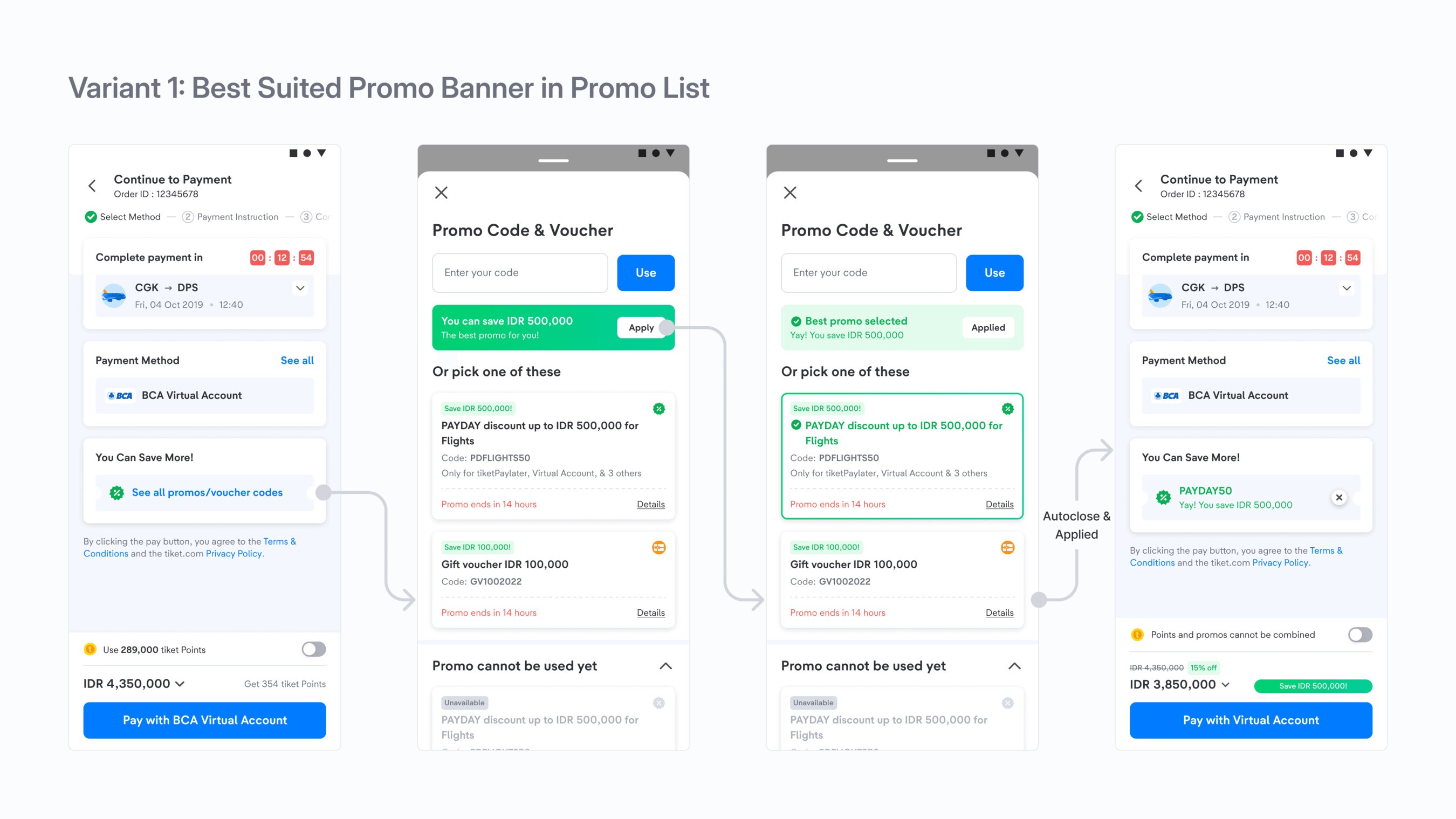
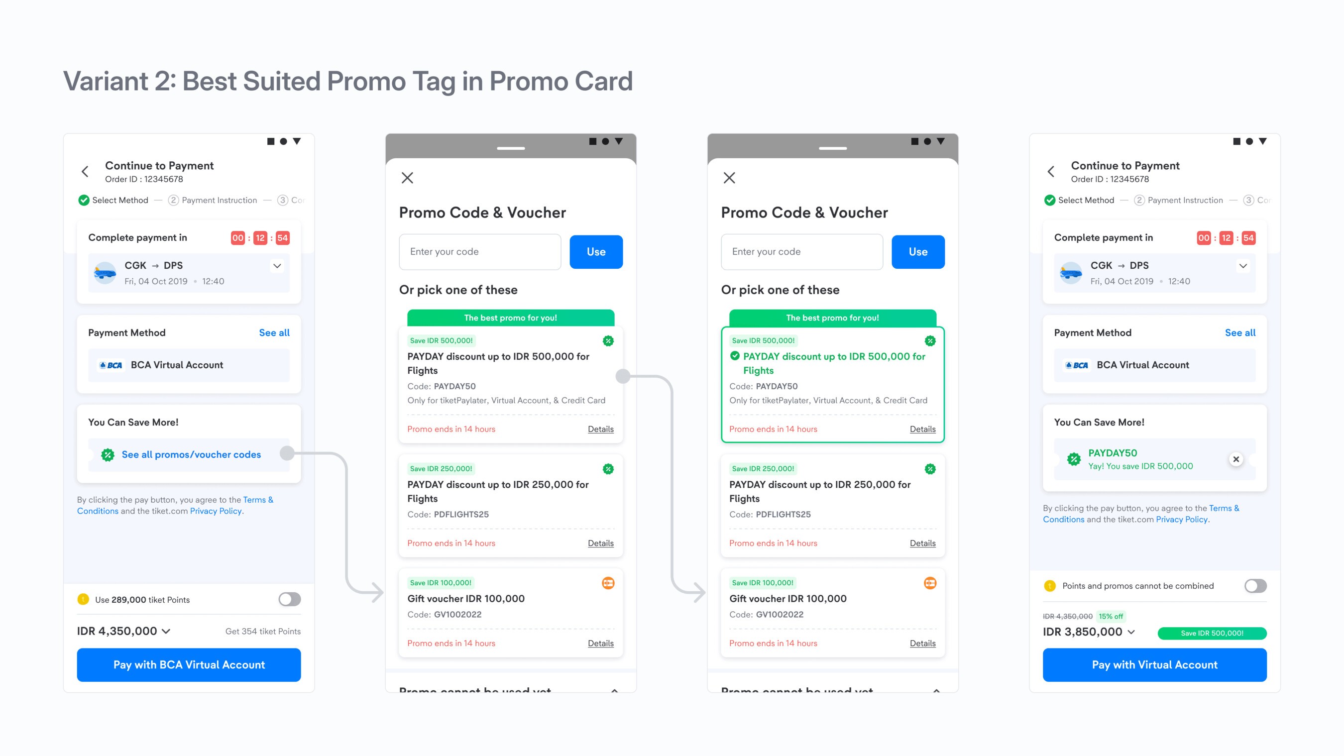
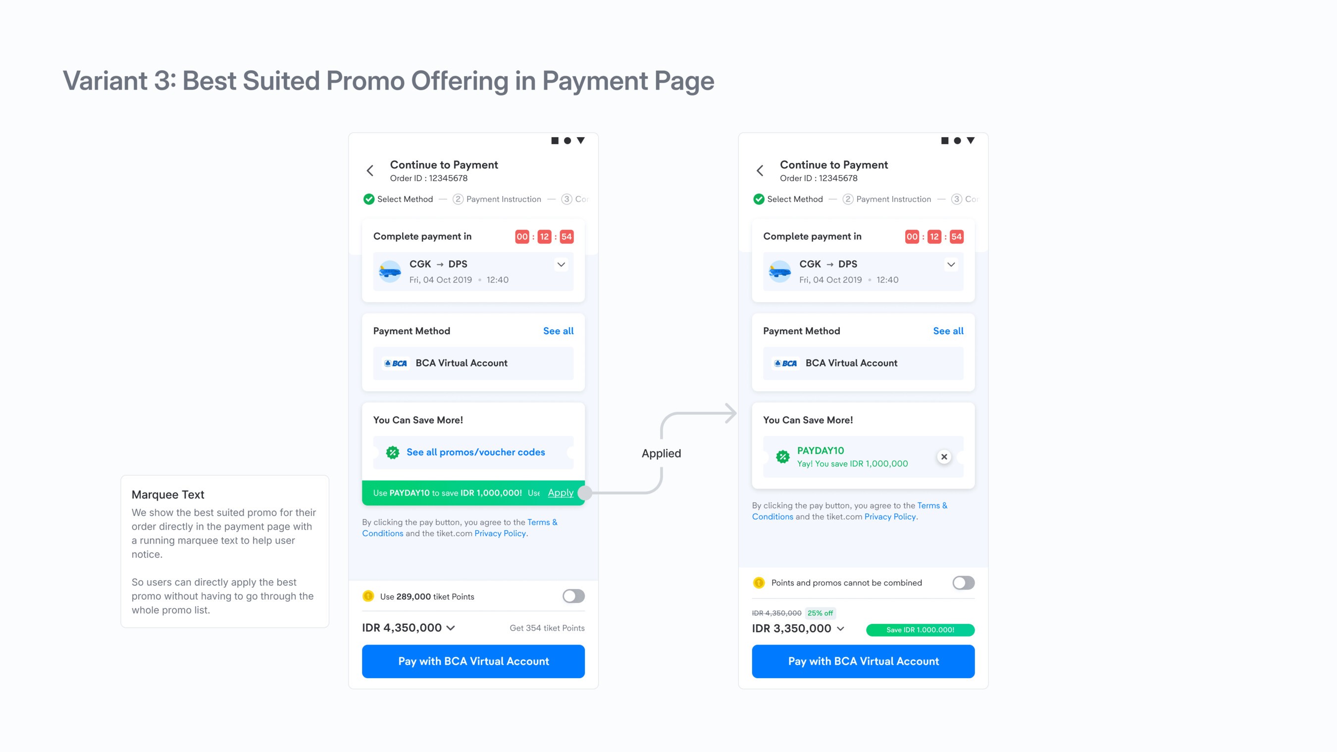
After weighing the variants against the project's goals and requirements, we took the first and second into testing. Both let users freely explore the promo list, giving them confidence that the suggested promo really is the best one available. The third showed the best promo on the payment page, but could still leave users in doubt since they hadn't seen the promo list.
We ran a multivariate test with these variants alongside the baseline design to find out which had the best impact on our metrics.
First A/B testing results
The test ran for two weeks, with these business metrics to achieve:
- Apply promo click through rate (CTR)
- Apply promo success conversion rate
- Contribution to paid order conversion rate
The results were positive. The first variant won, raising the apply promo CTR from 16.7% to 17.1% compared to the baseline, a relative change of 2.76%, with a positive impact on purchase value.
It was a success for our first improvement: small changes and quick wins. But we didn't stop there. We kept looking for room to improve and found these issues:
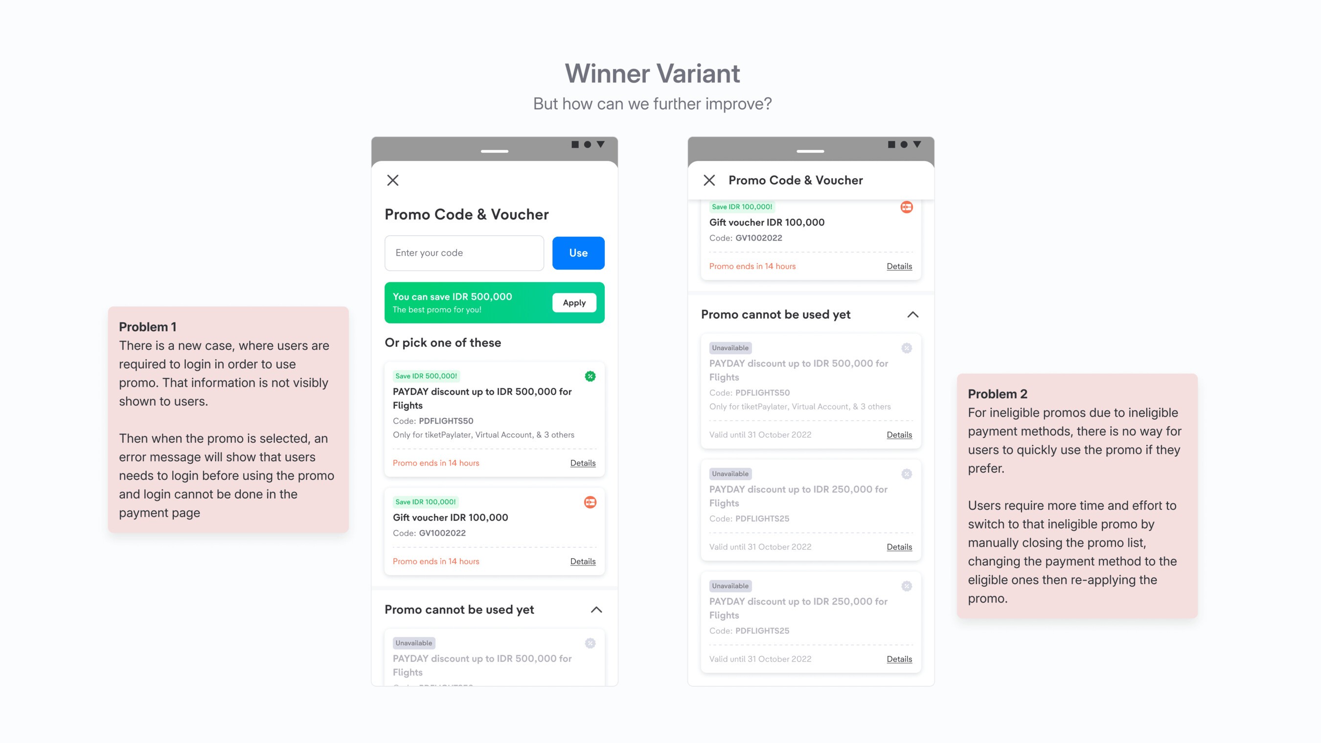
Given those issues:
How might we let users switch to a promo they aren't eligible for because of their payment method, if they still prefer that promo?
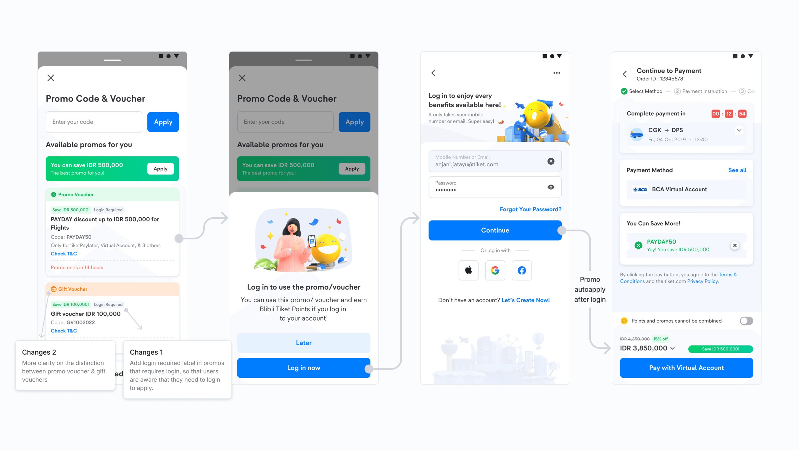
How might we help users apply promos that need a login or sign up, right on the payment page?
Second Iteration
Solution 1
Adding a login required tag
For promos that need a login, we added a clear tag showing that login is required before applying the promo. Users can log in right after picking the promo and come back to the payment page with the promo applied.
Solution 2
Switching payment method
For the second problem, we let users switch straight to the eligible payment method for ineligible promos. But giving every ineligible promo this option would contradict our best suited promo shortcut and clutter the list further. So we refined it to appear only on promos worth more than the current eligible one, giving users more control.
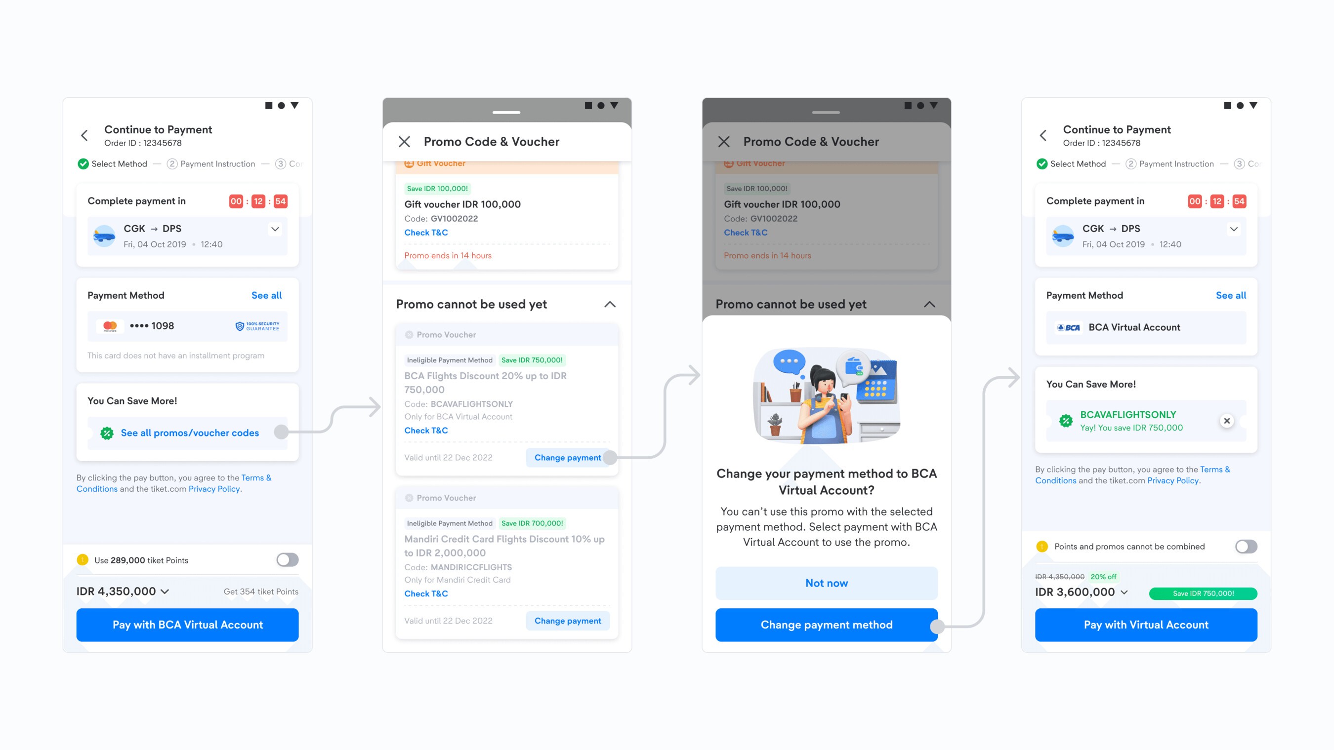
This feature brought big challenges in both design and development, with many edge cases, such as:
- Users who haven't activated their PayLater account but want to switch to it for a better promo.
- Users who haven't added a credit or debit card in the app, plus working out which cards are eligible for specific payment methods, and many more.
Despite these challenges, we solved all of them by:
- Understanding the tech team's limitations and capabilities
- Stress testing the flow with the product team to find more edge cases
- Ideating feasible solutions that still aligned with the business goals
Post launch analysis
After launching both improvements, we ran a post launch analysis:
- Login required flow: 7,300 users went from a promo to logging in within two months, an 8.85% conversion rate.
- Payment method switch: a 5.64% increase from promo application to purchase, at 99.8% significance.
- Best suited promo shortcut: promo applications through the banner rose 2.57%, at 99.8% significance.
In the end, we cut the time to convert from 5m51s to 3m31s and raised the overall payment conversion rate to 75.2%.
We learned that:
- Improving step by step solves problems effectively and efficiently, without changing everything at once.
- Experiments let us validate ideas quickly, without the risk of a full rollout.
Continuous testing and learning remain key. Now users can easily apply the best suited promo for their orders on tiket.com, without any hassle.