
Rider Loyalty Program
- Product
- 2024 – 2025
Redesigning Delivery Hero's global loyalty program
Delivery Hero operates one of the largest delivery platforms globally, with millions of riders working across dozens of markets. To support rider engagement and retention, the platform runs a tier based loyalty program where riders unlock benefits as they complete deliveries.
The program spans 70+ countries and 11 brands, making it one of the key drivers of rider motivation and retention across platforms.
However, research revealed that the product experience made it difficult for riders to clearly understand their tier progress, their benefits, and what they needed to do to reach the next level.
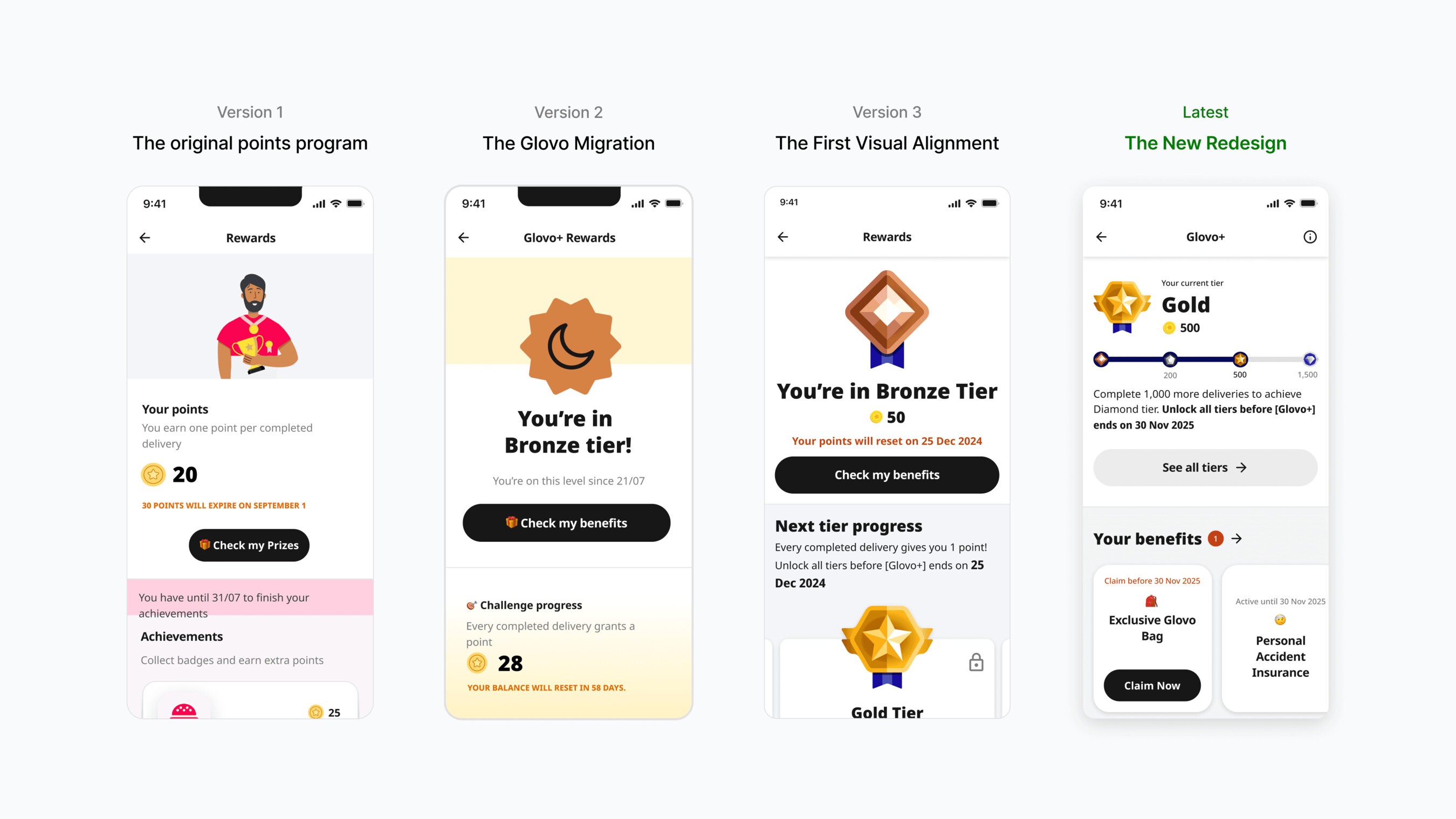
Evolution of the loyalty program
Before diving into the redesign, it's important to understand how the loyalty experience reached its current state. The system had gone through several iterations over the years.
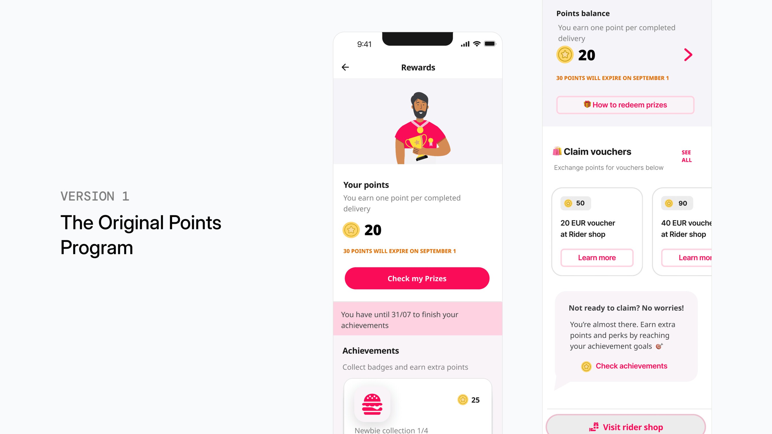
V1: The original points program
Delivery Hero initially ran a points based loyalty system in several markets. Riders collected points through deliveries and could redeem them for benefits. While functional, the points model made it harder to communicate progress and motivation clearly.
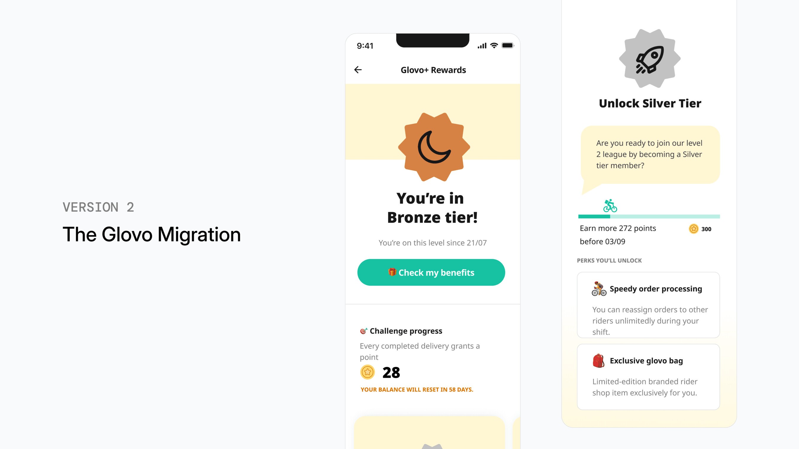
V2: The Glovo migration
Following the Glovo integration in 2024, Delivery Hero adopted Glovo's tier based loyalty structure. It introduced clearer progression, from Bronze and Silver to Gold and Diamond, with riders unlocking benefits as they reach higher tiers. However, the UI was largely adopted as is during the migration.
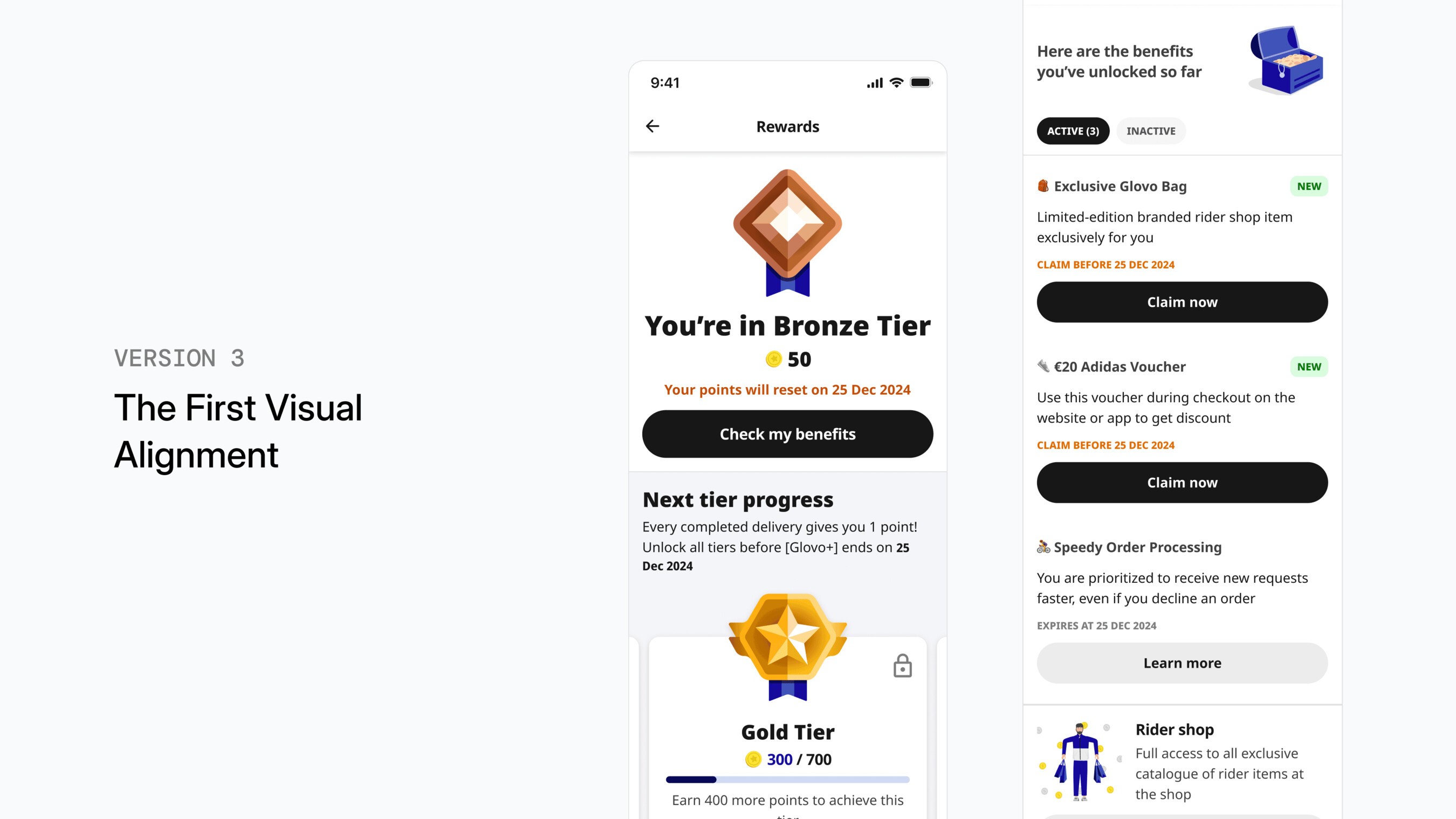
V3: A first visual alignment update
The first design update after the migration was mostly cosmetic. Engineering capacity was limited at the time, so the focus was on:
- Aligning the UI with Delivery Hero's design system
- Fixing some basic heuristics
- Improving visual consistency
But structurally, the experience stayed the same, so many of the underlying usability problems were left unsolved.
The Real Problem
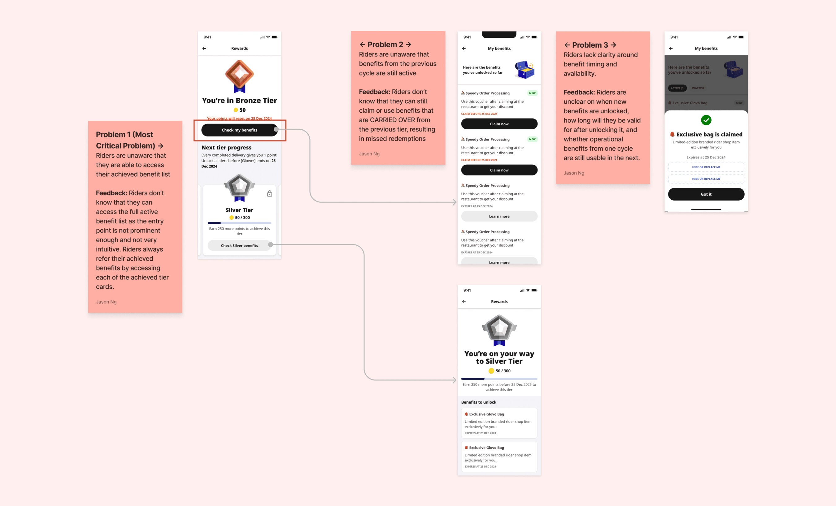
Eventually, regional operations teams began raising repeated patterns of confusion from riders using the program. These teams are in direct contact with rider support and often see friction earlier than product analytics alone. In short:
Riders were struggling to understand how the loyalty program worked. Not because the program itself was complicated, but because the app didn't make it clear how the system worked.
Common questions from riders included:
- What tier am I currently in?
- How far am I from the next tier?
- Which benefits do I actually have right now?
- Do I need to claim benefits or are they already active?
- When exactly do these benefits expire?
These questions sound simple. But when riders can't answer them quickly, the motivational effect of the entire loyalty system weakens.
Validating the problem
Rather than jumping straight into redesigning the UI, we gathered more data points to break down what was actually happening. We looked at the problem from several angles:
Product analytics
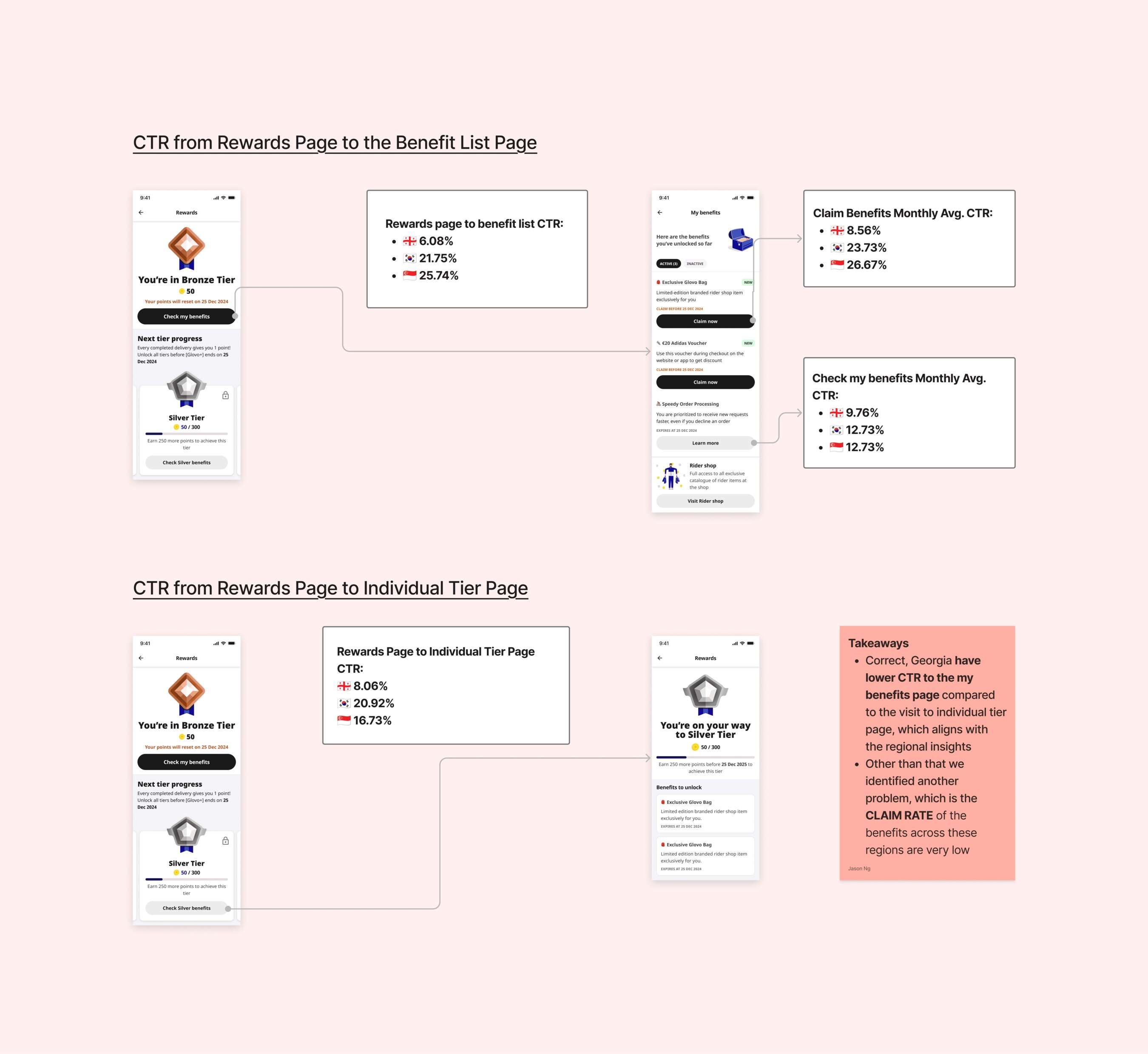
Most riders never explored beyond the loyalty home screen
Interaction analytics showed that riders rarely explored deeper parts of the loyalty experience, such as benefit details or tier progress. Most interactions stopped at the surface of the loyalty screen, suggesting riders weren't fully engaging with the system.
Behavioral recordings
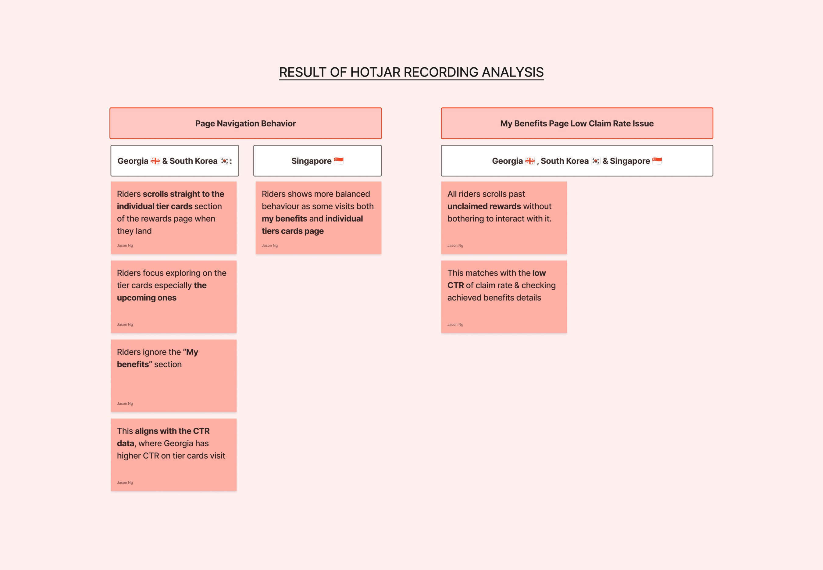
Riders opened the loyalty page but struggled to make sense of it
We also looked at behavioral patterns and session recordings. Watching riders use the loyalty pages made something clear very quickly. Riders weren't ignoring the feature. They were trying to understand it, but often had to scan several areas of the interface to find what they needed, and most dropped off before they did. The issue wasn't a lack of interest, but a lack of clarity.
Multi market surveys
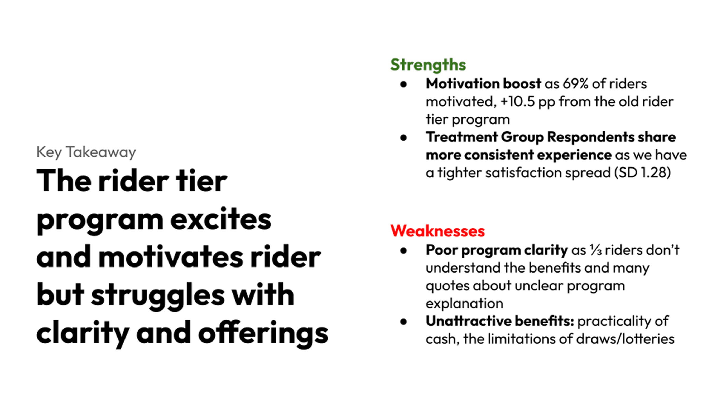
Some riders still didn't understand the program mechanics
In surveys across markets, most riders recognized the value of the program, but many struggled to understand tier progression, benefit eligibility, and what they needed to do to reach the next tier. Improving benefit visibility and progress clarity would play a key role in rider motivation and engagement.
First Iterations
Based on the insights from analytics, rider surveys and behavioral recordings, we introduced the first iteration of improvements to the loyalty experience.
Improvement 1
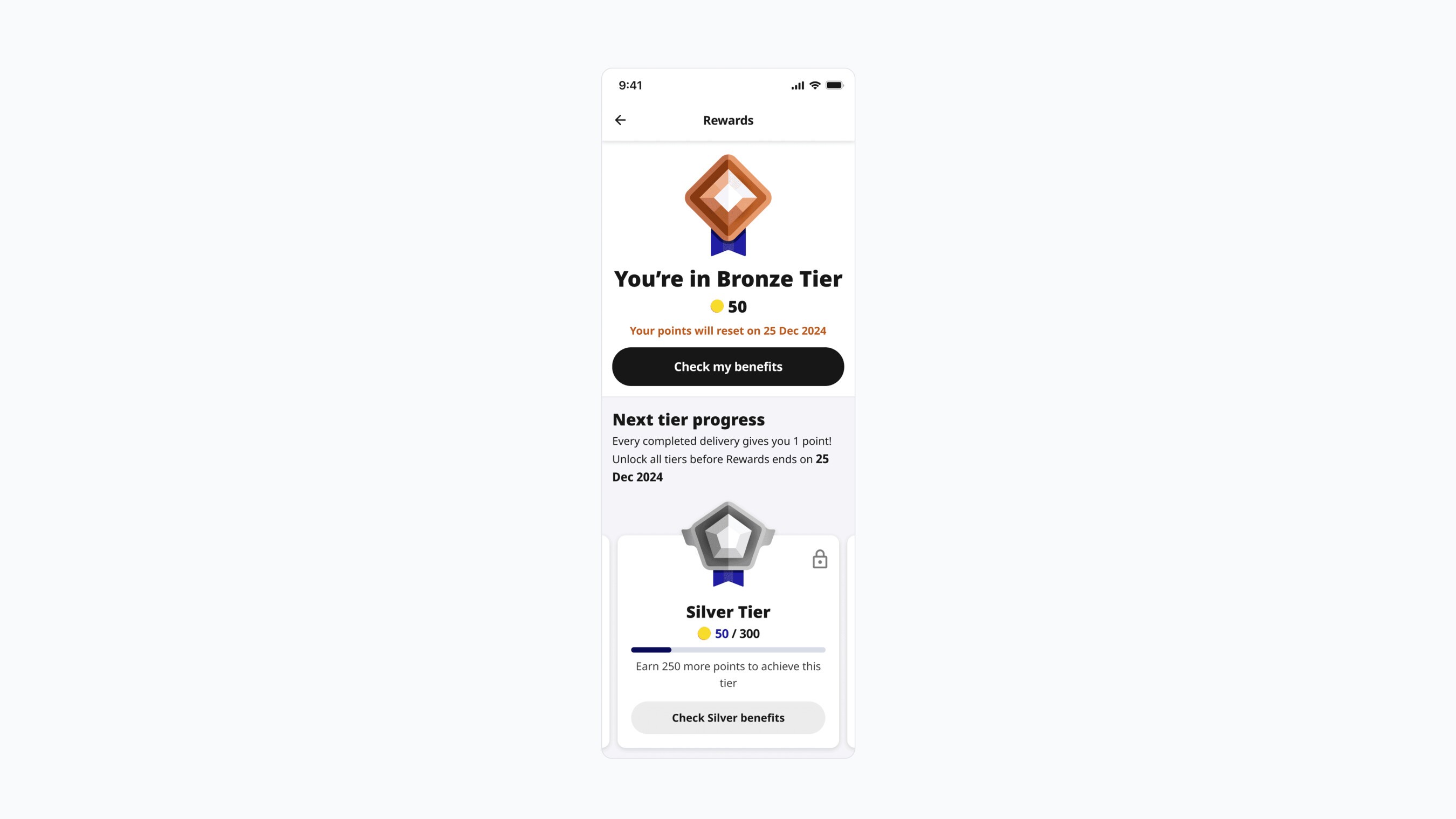
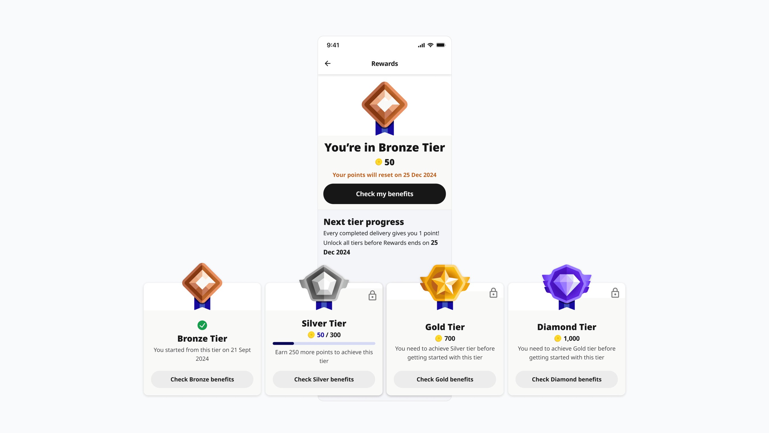
Progression should always be visible upfront
Riders struggled to understand where they were in their progress, since we only highlighted the next step. The page wasn't using its space well.
We introduced a clearer progress indicator upfront, showing the deliveries completed and how many remain to unlock the next level, so riders understand at a glance where they are.
Showcase benefits upfront
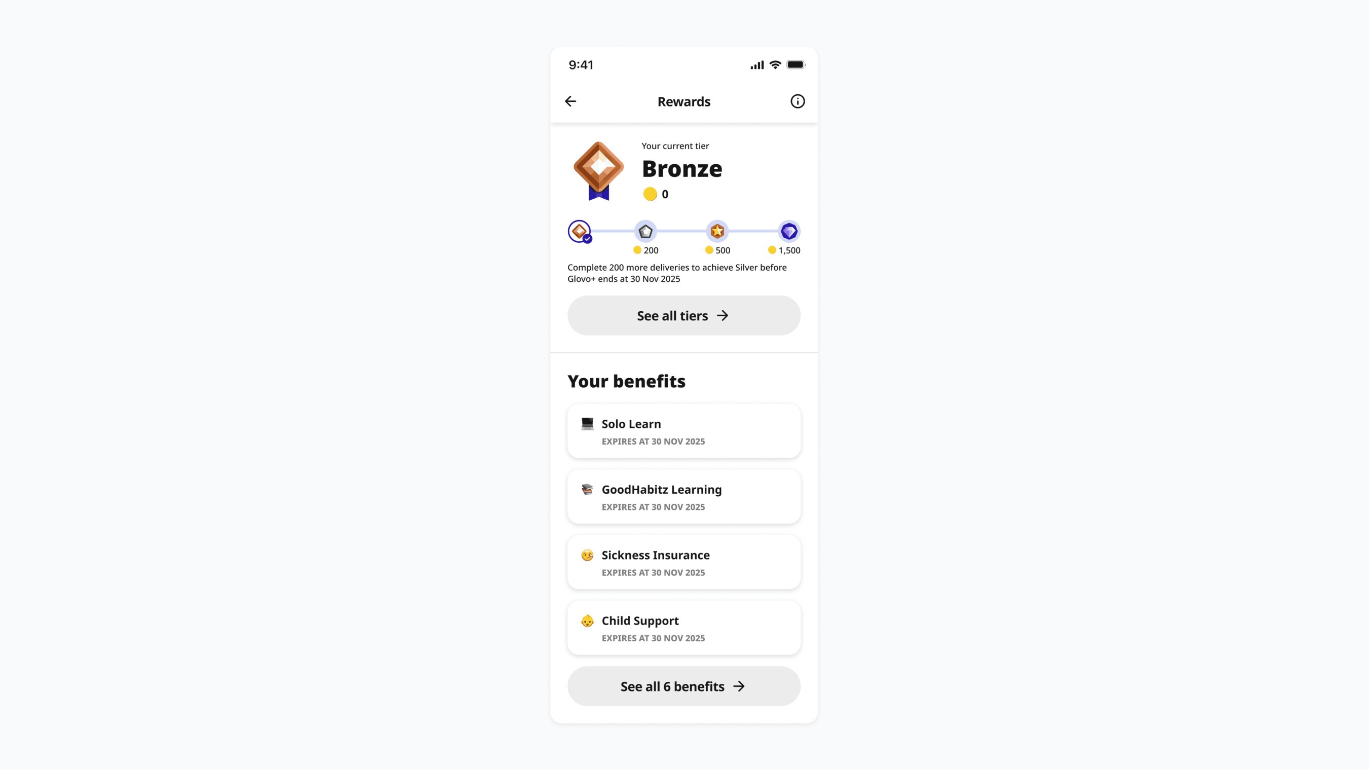
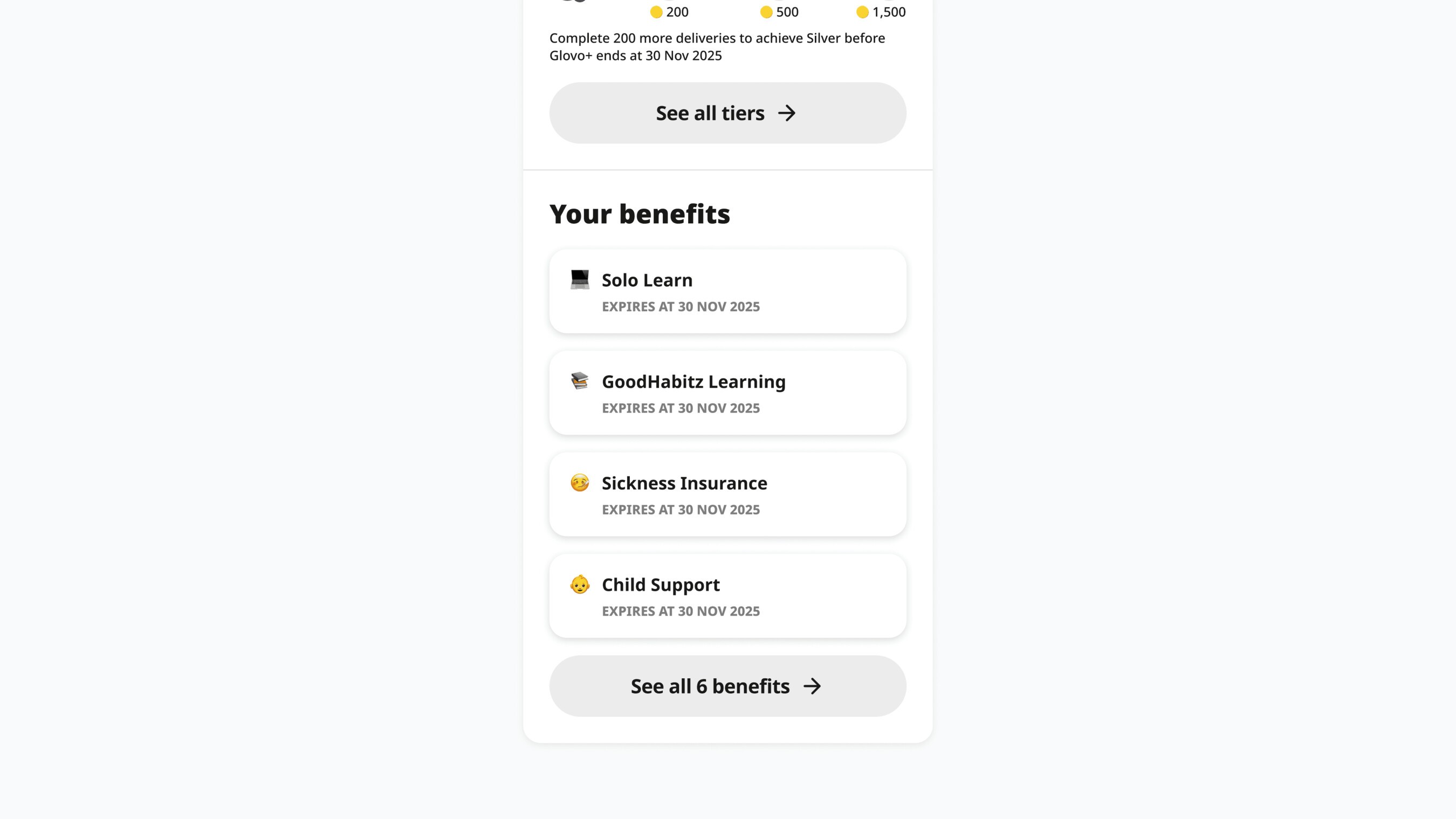
Benefits riders had achieved were buried on another page. This was one of the major problems raised by the regions, and the data backed it up: few visits to the benefit list and low claim rates, since the only way in was a single button riders didn't notice.
We replaced the second half of the page with their five latest benefits and a way to see all of them, so riders notice at a glance which benefits they've unlocked.
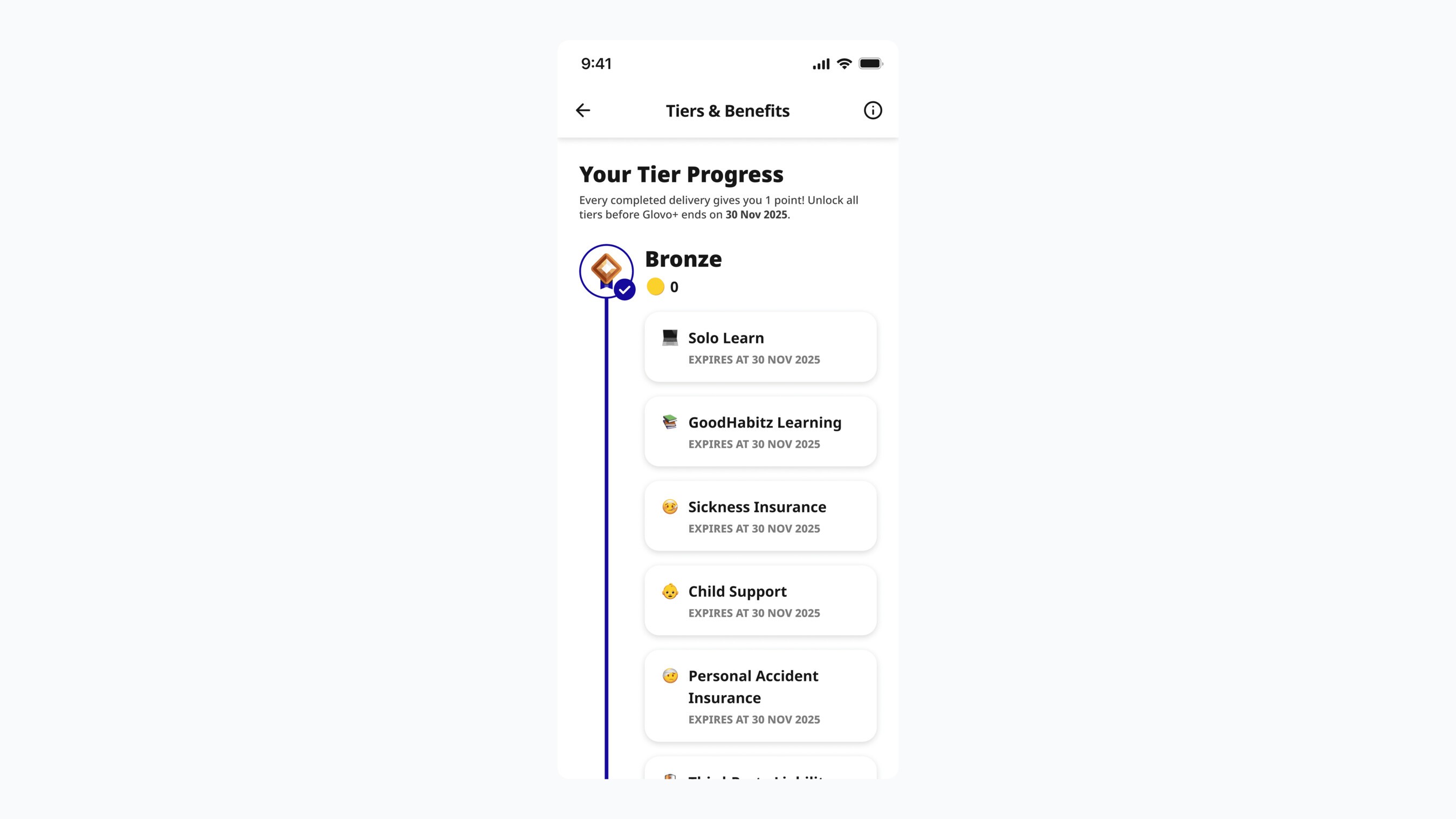
Easier navigation connecting every tier to its benefits
To see the deliveries required and the benefits included in upcoming tiers, riders had to go back and forth, since the way in sat under each individual card.
We brought it all together on a single page, so riders can scroll through the tiers and the benefits each one includes.
Usability Testing
Since riders use the loyalty program in many markets, it was important to validate whether the new structure was actually easier to understand.
We ran a structured usability test in Maze with riders from Poland, with 11 tasks covering the full loyalty journey, including:
- Understanding tier progression
- Identifying unlocked benefits
- Discovering benefit details
- Claiming rewards
- Interpreting benefit validity
Riders completed many tasks without any major issues, a strong signal for the new design. But a couple of problems were worth improving:
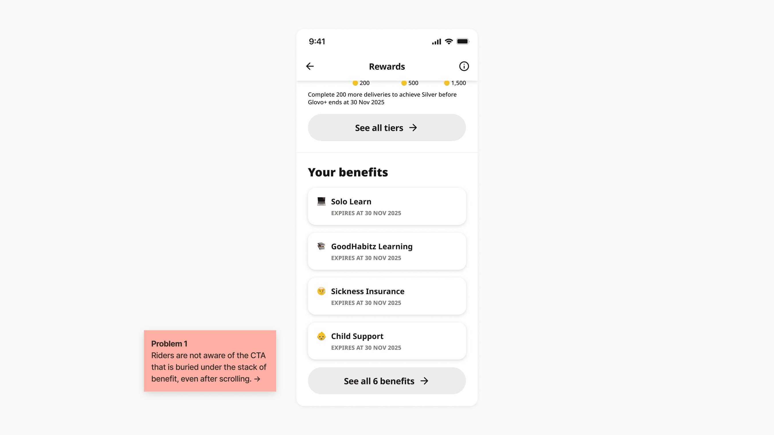
The highlighted benefits work, but the layout doesn't
Riders immediately knew where to find their benefits on the loyalty home page, an improvement over the previous version.
But the way into the full benefit list still lacked visibility, buried under the highlighted benefits. Even after scrolling, most riders didn't notice it.
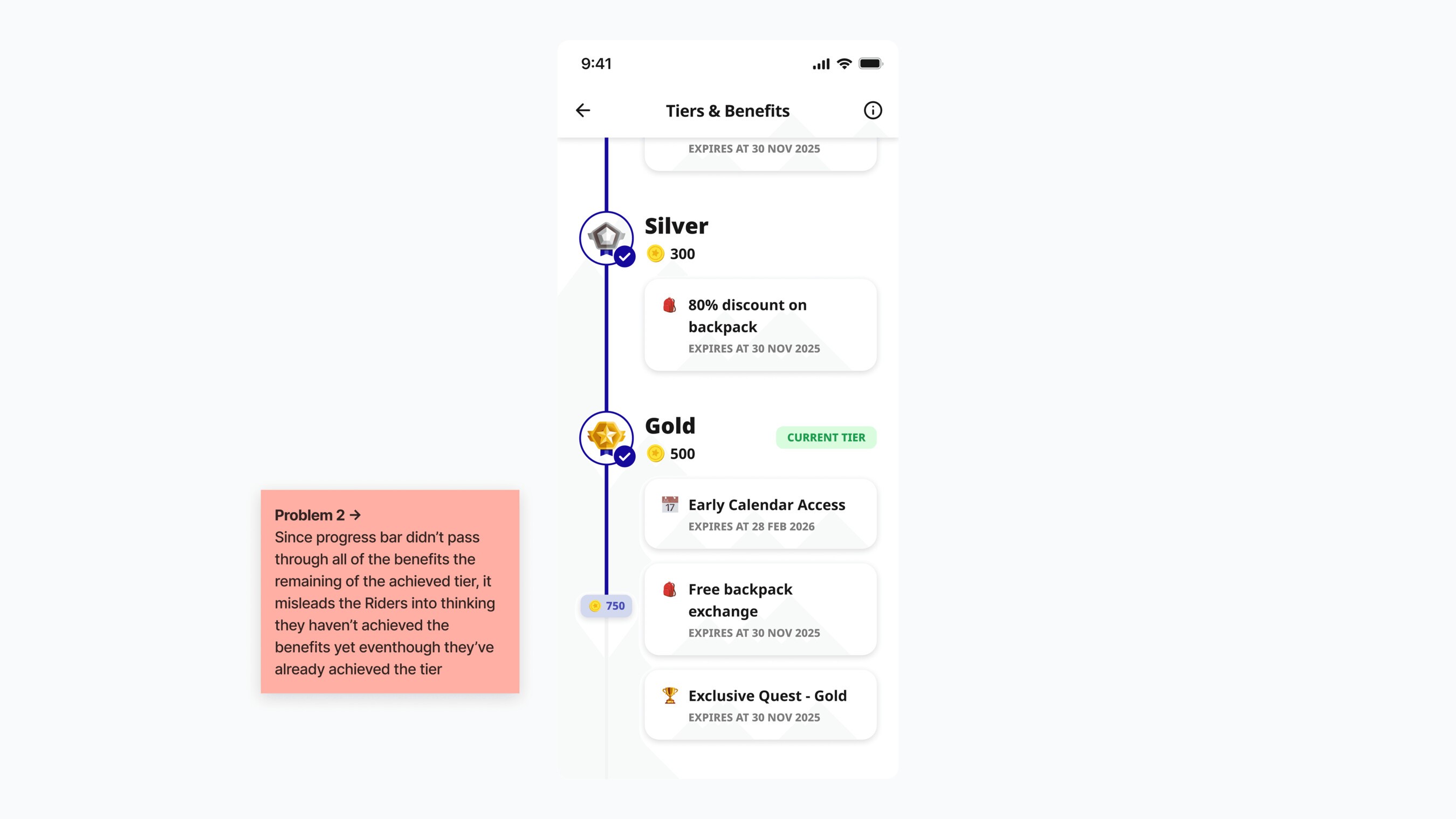
Tier progression and included benefits became misleading
Riders understood that the progress bar showed their progression, but the way the information was grouped suggested they hadn't received the benefits of tiers they'd already reached, because the progress bar hadn't passed through them.
In reality, riders unlock all of a tier's benefits as soon as they reach it. The progression itself was clear; how the information was grouped and shown needed work.
The regional team also worried that the list could get very long with all the included benefits, making riders scroll every time to find information about upcoming tiers.
Designing the new experience
With the problems from the usability test identified, we iterated further on the design to meet riders' needs.
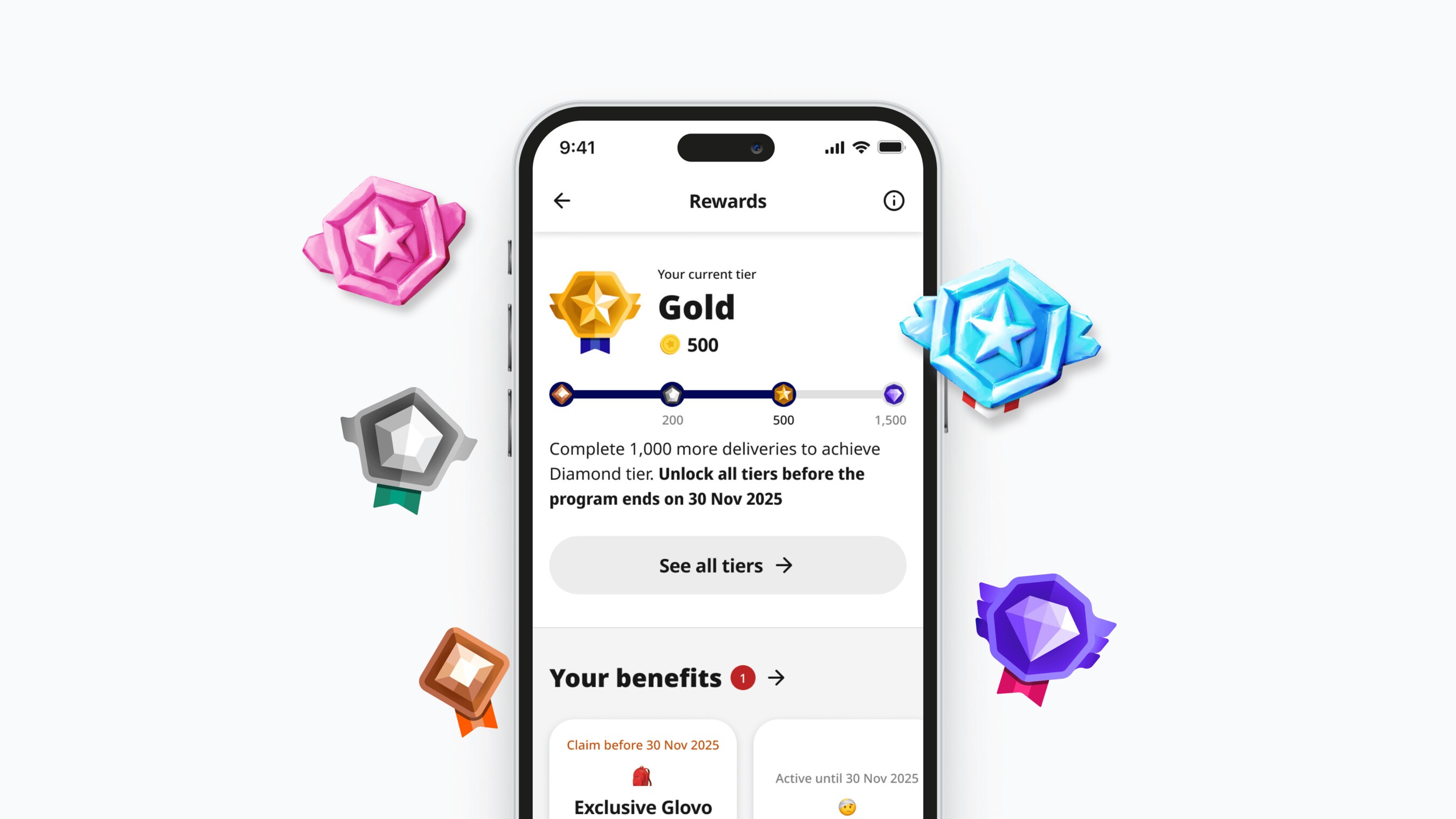
The loyalty home page
The improved design immediately answers the three most important rider questions:
- Where am I now?
- How far am I from the next tier?
- What benefits do I currently have?
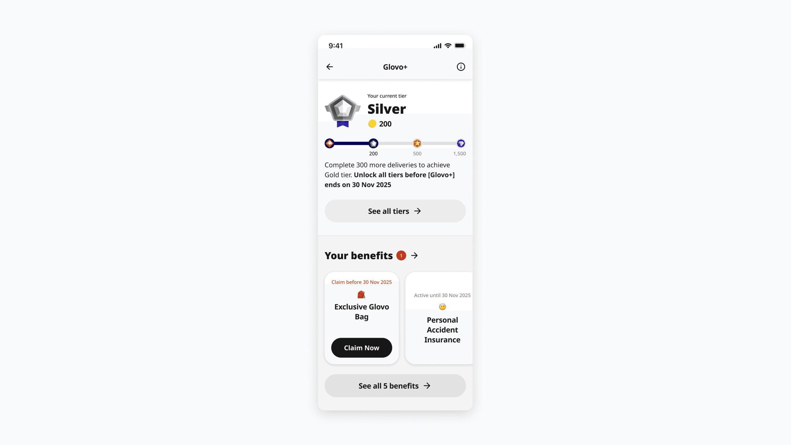
Below that, the Your Benefits section shows unlocked benefits in a horizontal scroll instead of a vertical list. This keeps the section compact while making the See All Benefits button more visible.
Tier progress
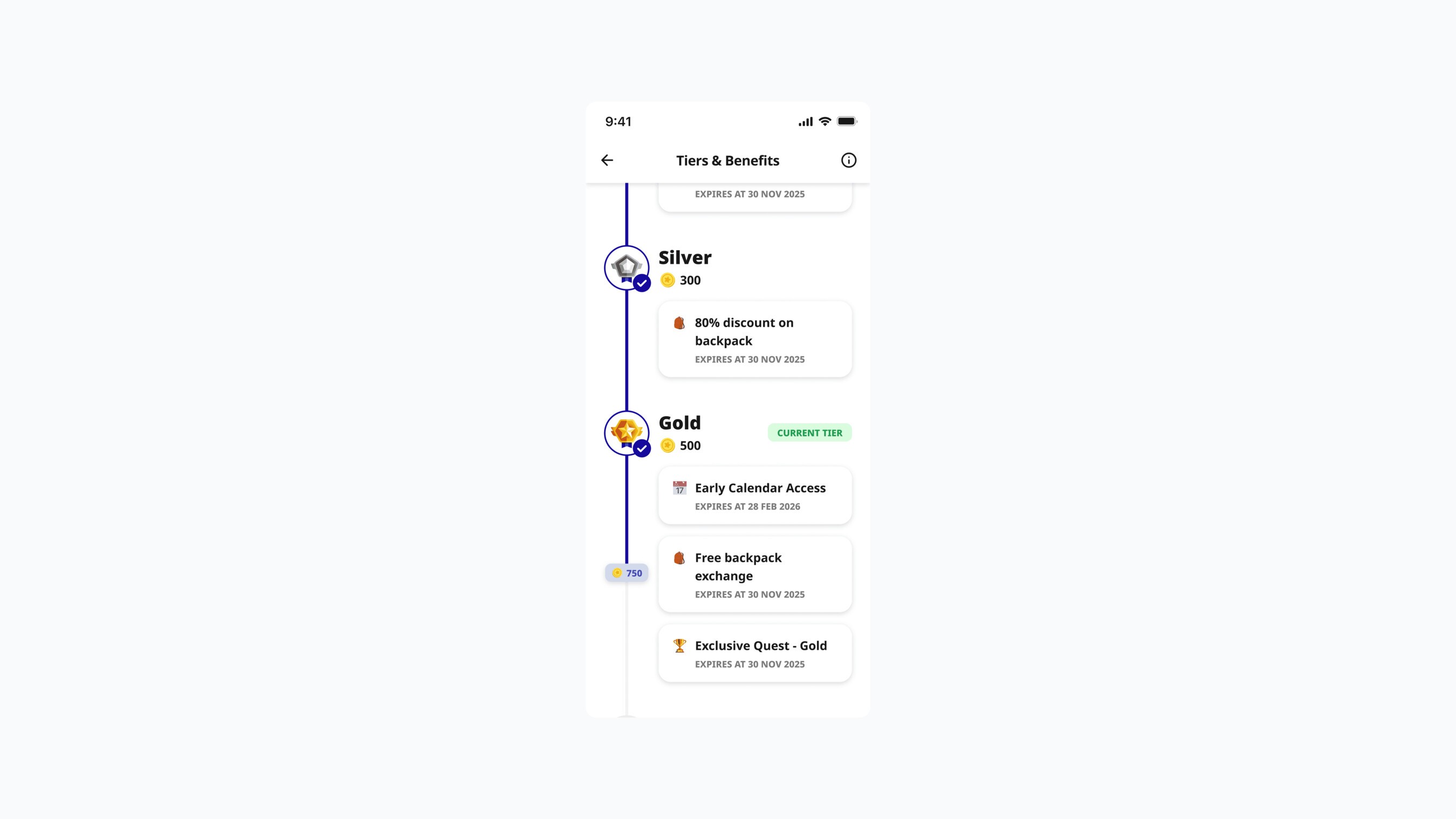
The previous design used a long vertical list of tiers. In testing, this made riders scroll through a long page and sometimes read tiers as sequential rewards rather than distinct levels.
We switched to horizontal tier cards, where each card clearly shows:
- The tier
- Delivery requirements
- Included benefits
- Tags showing the rider's current status
This makes comparing tiers faster and avoids long vertical scrolling.
Benefit list
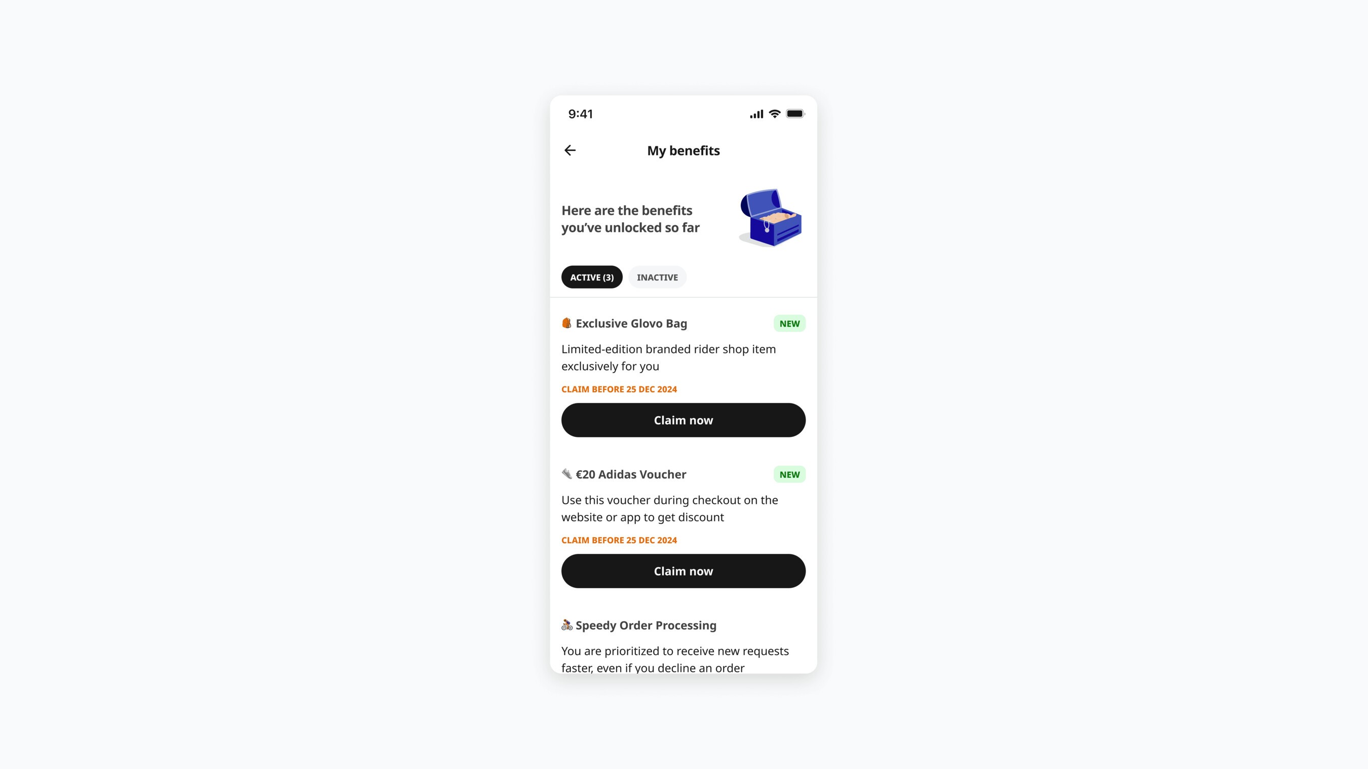
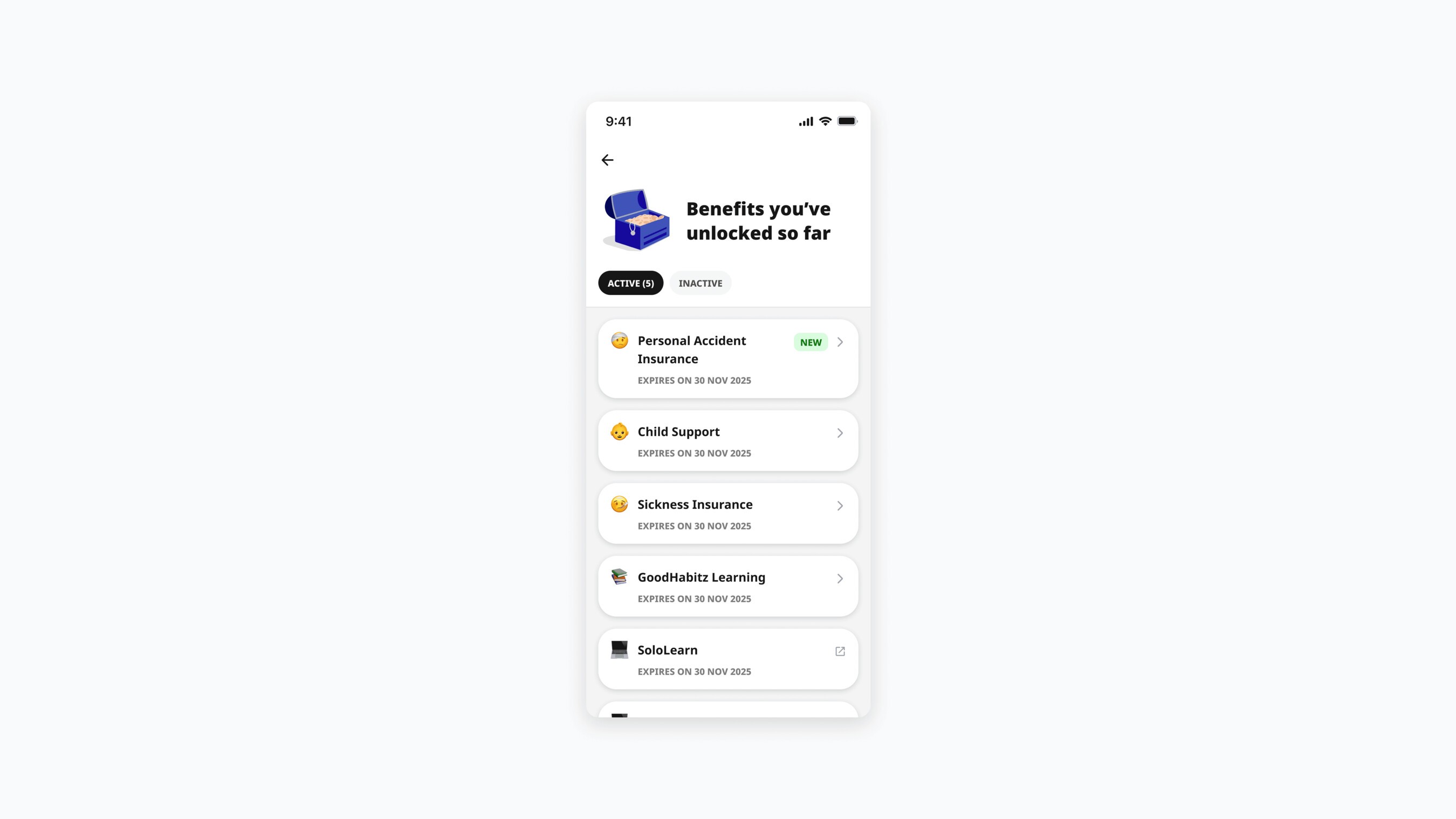
Usability testing showed the benefit list already worked well. Riders understood that benefit cards were interactive, and claim actions were easy to find. We simplified the visual elements so more benefits fit on screen and riders don't have to scroll as much to discover them.
Results and early signals
Engagement signals after the first loyalty update
Before the full redesign in this case study, the loyalty experience had already gone through an earlier iteration after the Glovo migration (V3 above), which focused on aligning the interface with Delivery Hero's design system and fixing smaller usability issues.
After V3 rolled out, we analyzed rider engagement across multiple markets using retention data. Across the observed markets, average 8 week rider retention improved by 54%.
While this wasn't a controlled experiment, the results suggested that improving the loyalty experience went together with stronger rider engagement across several regions.
Given the scale of Delivery Hero, even modest improvements in rider retention translate into meaningful impact across millions of deliveries.
Why a deeper redesign was still needed
Despite these positive signals, feedback from regional teams and rider research showed the experience still had significant clarity issues, as described above. The program worked, but its motivational loop wasn't as strong as it could be.
The redesign in this case study focused on those clarity issues, to make the loyalty program an even stronger driver of retention and motivation.
The final redesign
The redesigned loyalty experience has now been built and rolled out by engineering. Since it launched recently, its long term impact on rider behavior is still being evaluated.